Wildlife photography is all about the color... until it isn't. Most frames fail the B&W test. I break down the two things I look for in an image to decide if it's worthy of monochrome.
The Decision to Remove Color is a Decision to Add Focus
We chase color as wildlife photographers, especially as bird photographers. So much of the expression and interest we get in nature comes from those colors. From the interplay of a brightly colors subject, to the warmth of the sun in the morning, to the fall backdrop making the whole scene look orange. But sometimes, color isn't an asset, it’s a distraction. It clutters the frame and fights with the real subject. That’s when the conversation needs to shift from:“How can I make the colors pop?” to “What if I strip them away entirely?”
The choice to process an image in black and white isn't one I make often honestly, so few frames "work" in black and white when it comes to wildlife, the the ones that do, I just can't imagine them being anything else. I also don't shoot for monochrome, it's usually a decision that I make after, when analyzing the structure of a photo and figuring out the story I want to tell.
Here’s how I evaluate a photo in post and know it belongs in the dark side of the palette:
1. The Test: Does the Color Add or Subtract?
If I’m unsure, I ask myself one simple question: Is the color of this image essential to the story? This is the first and biggest hurdle.
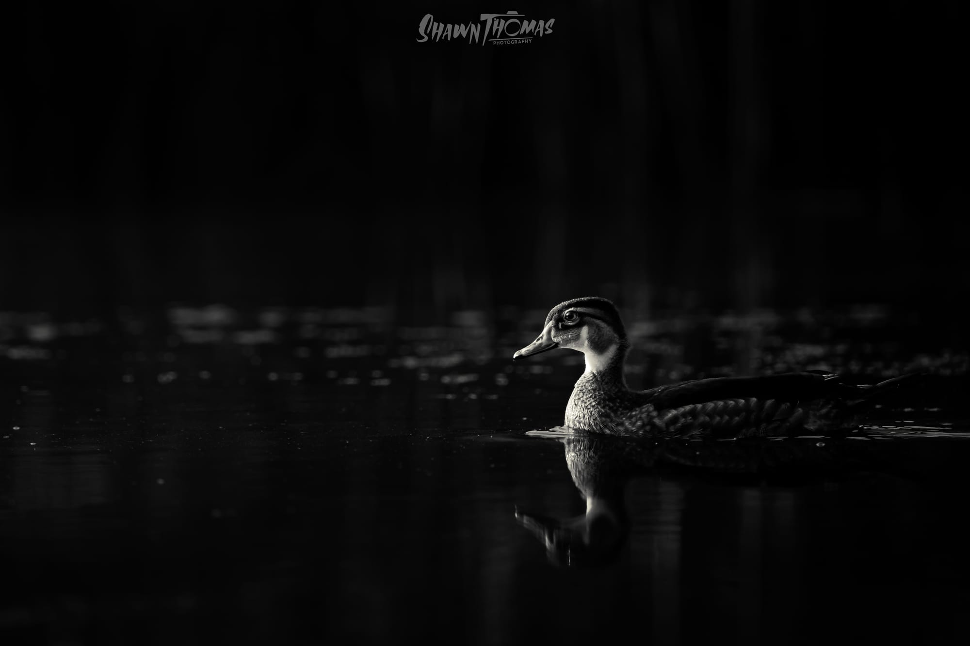
If the story is “That bright red eye on that wood duck really makes this photo!” then color is essential, and B&W subtracts from the moment.
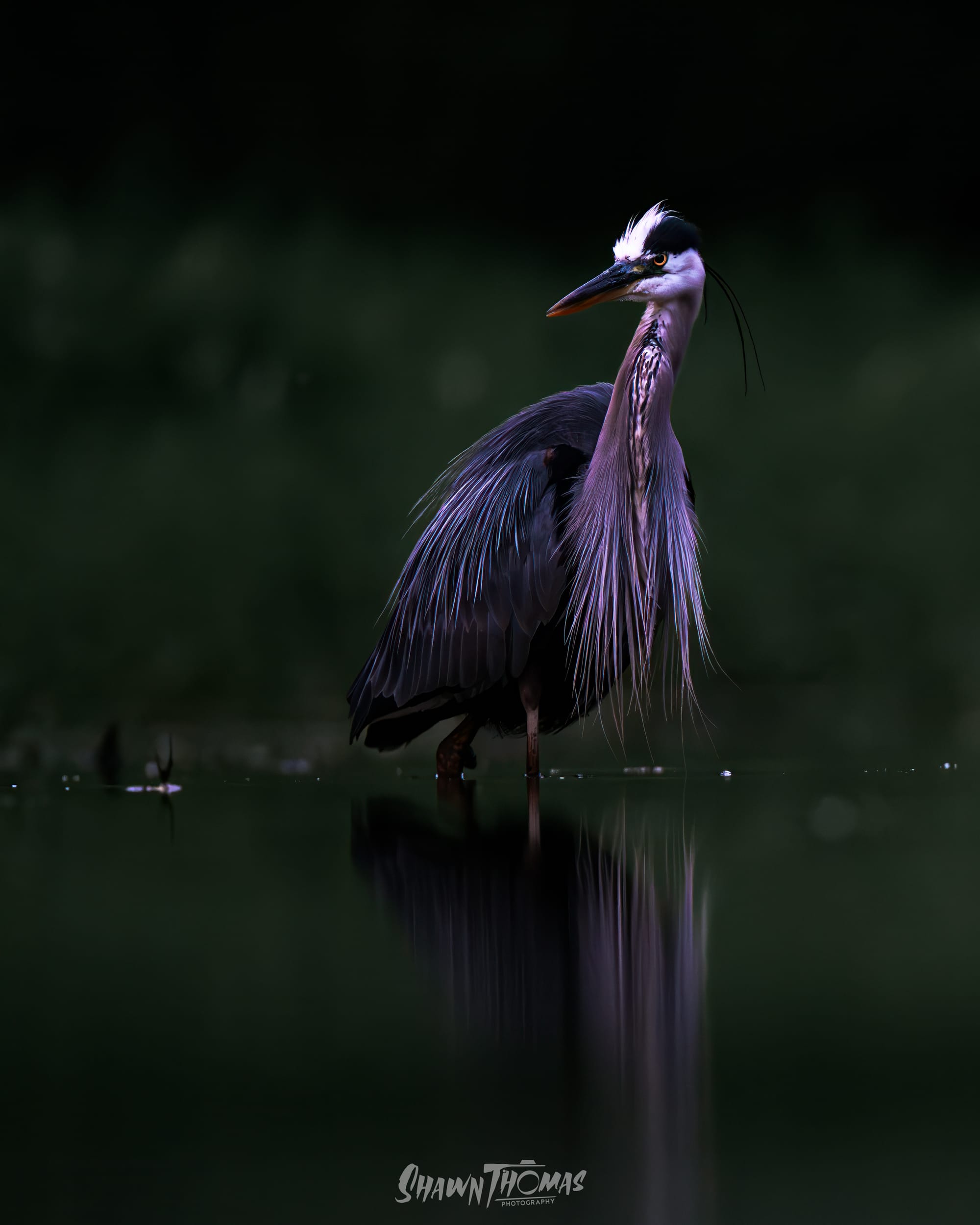
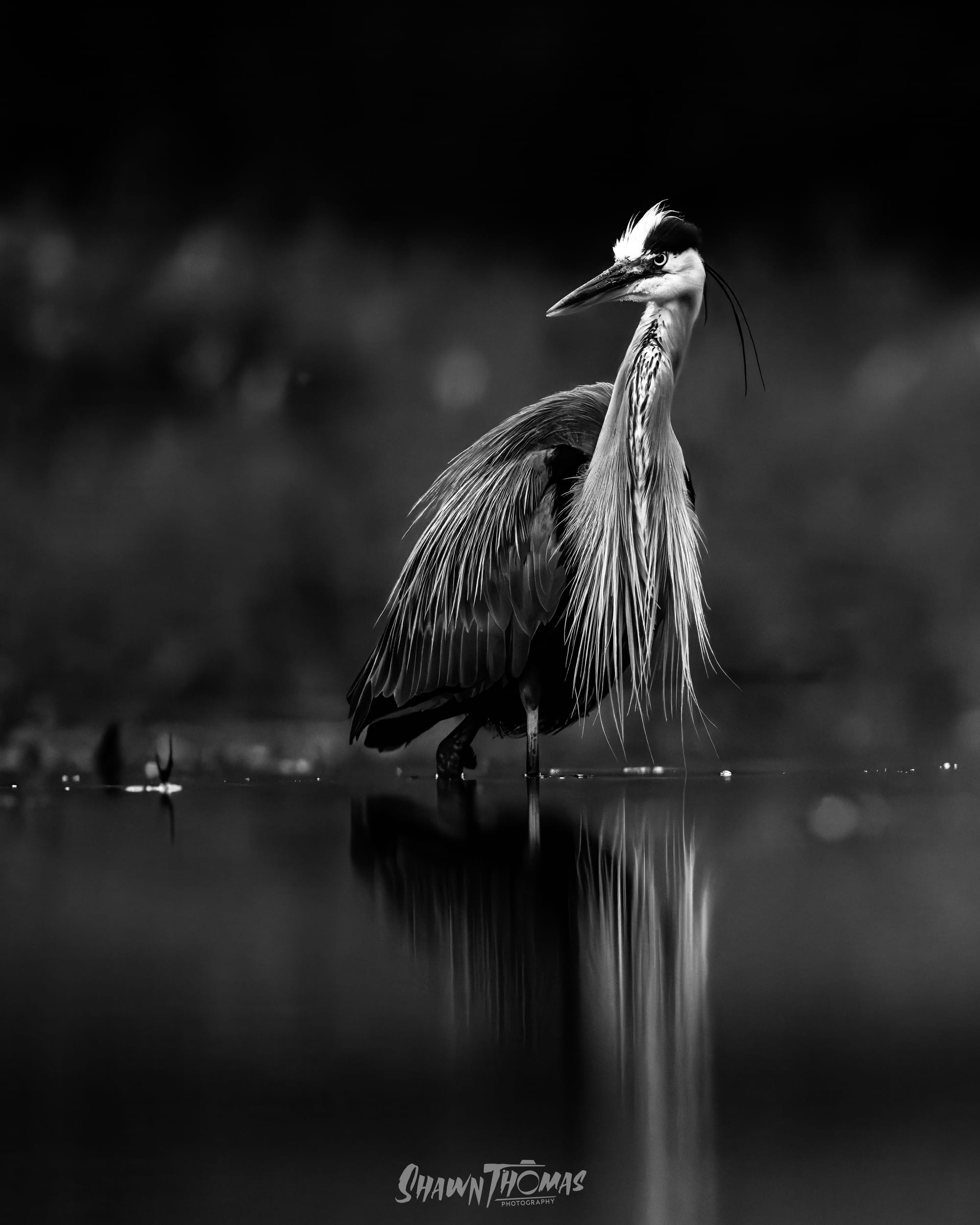
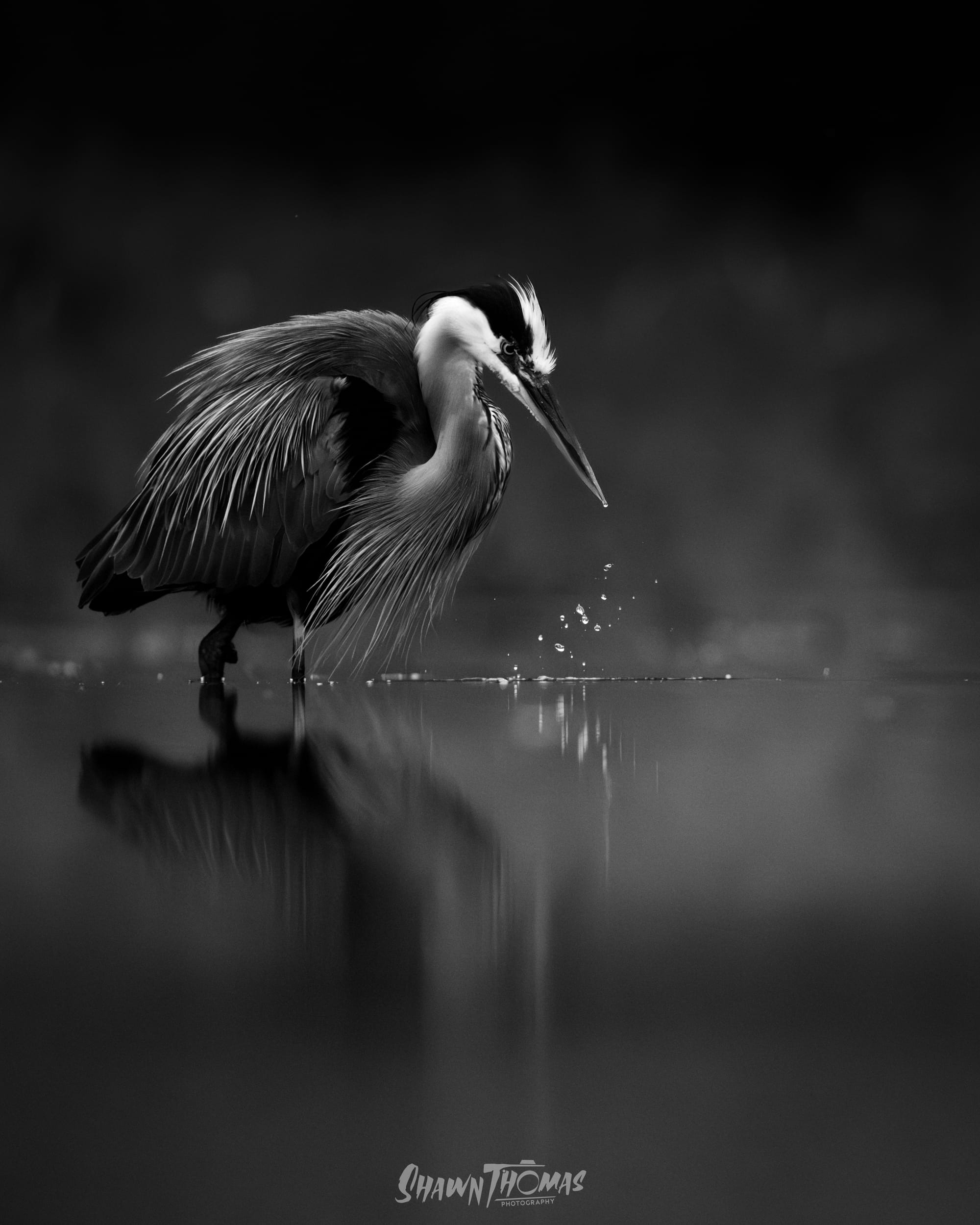
If the story is “Look at the solemnity of this Great Blue Heron caught in the darkness,” then the actual hue is secondary. Color can even diminish the power by adding a distracting cast to the shadows.
When you remove color, you elevate mood. You force the image to be about texture and contrast and that changes how it's seen, but more importantly that changes how it's felt.
2. Analyzing Structure: Focus on Form and Geometry
Since the decision is made after the shot, I look at the raw file and ignore the colors, asking: Does this image survive on shape alone? Black and white is a medium of geometry and texture.
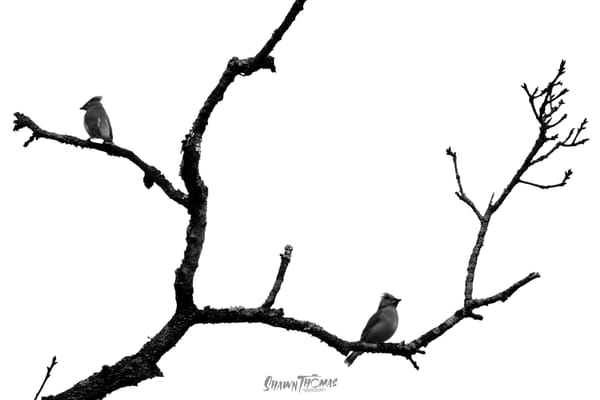
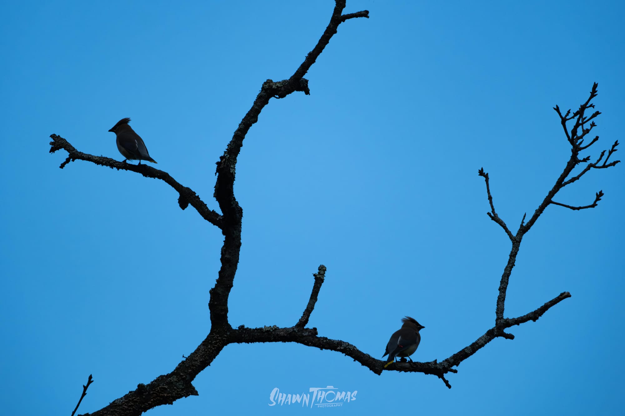
Structure and Contrast: I look for strong lines, hard shadows, and repeating patterns. Does the light create dramatic contrast? I look for the strong lines of a dark, bare branch against a bright sky. That's how you get a purely graphic image, like the two waxwings placed symmetrically on that stark, jagged branch. The color version is a cluttered snap; the monochrome is a study in balance and geometry. Also blue sky backgrounds are horrendously boring to me.
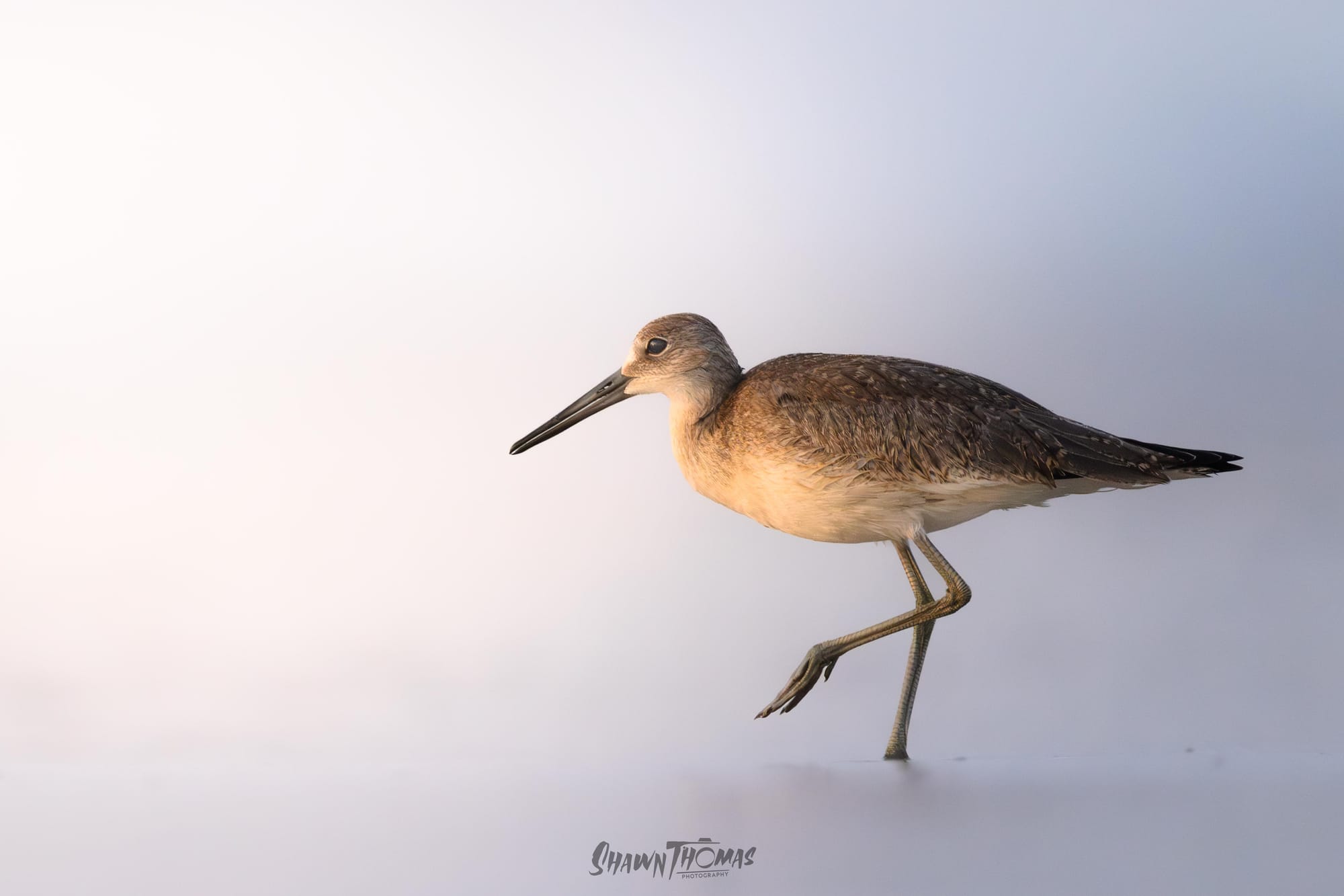
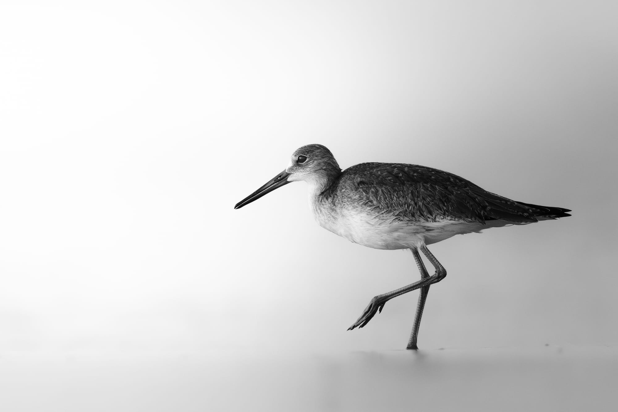
Negative Space and Clarity of Form: Images with vast amounts of negative space, like the Willet, work beautifully in B&W because it strips the background to a baseline of pure form. The color version is lovely; it tells a soft, ambient story with gentle tones. But when I commit to B&W, I eliminate the tonal ambiguity of that soft light and crush the background to clean white. This is critical for minimalism. The B&W conversion ensures the Willet's delicate silhouette and movement are the only things you see, making it a study of form and texture isolated against pure space. You can really go either way with this one, in fact I have. The color version is printed and hanging in my house.
3. The Edit: Elevating Texture Over Tone
The B&W conversion isn't just a desaturation slider, it's a deliberate re-shaping of tones using color channels. This is where I push the structure and texture to their limit.
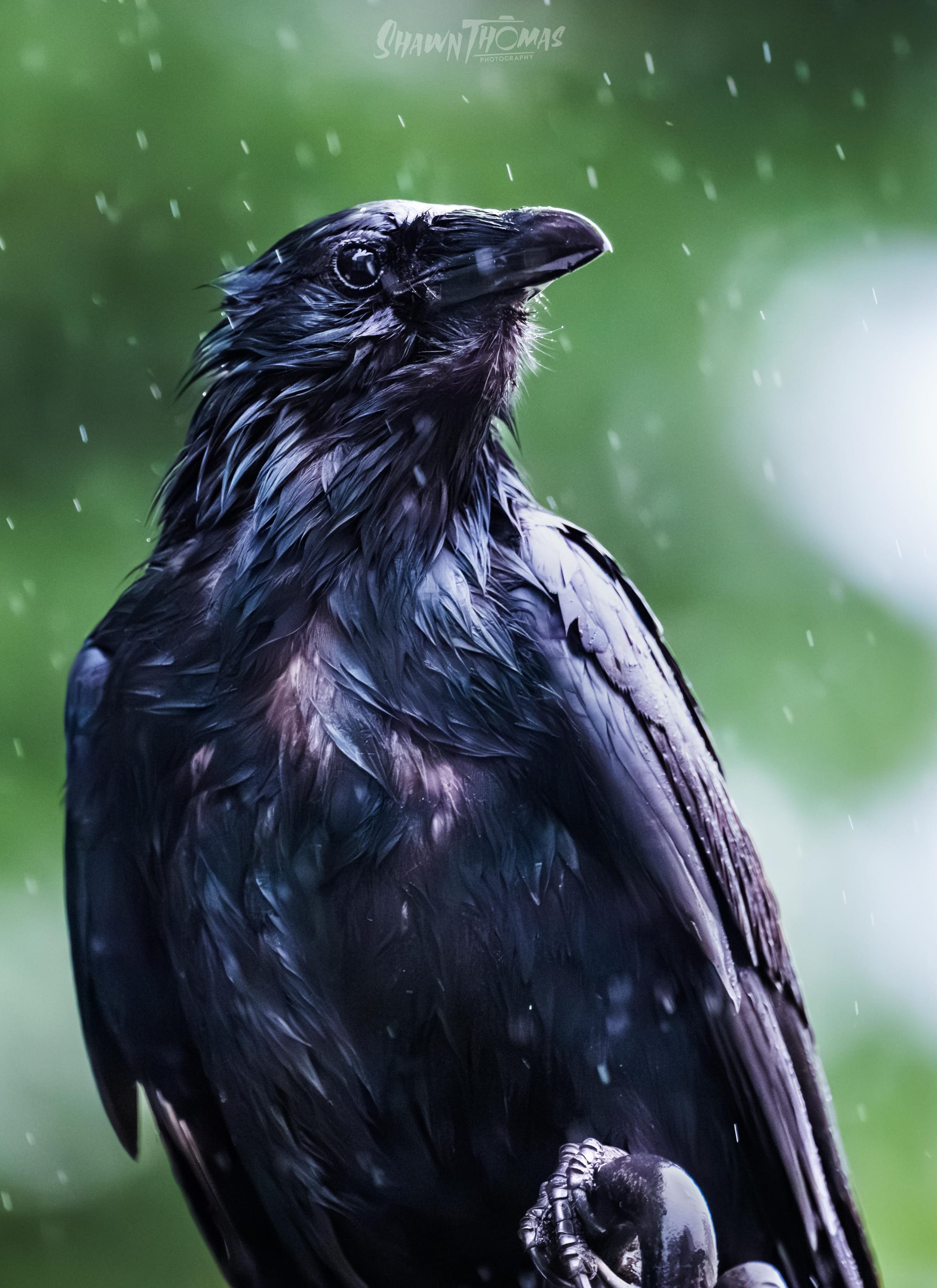
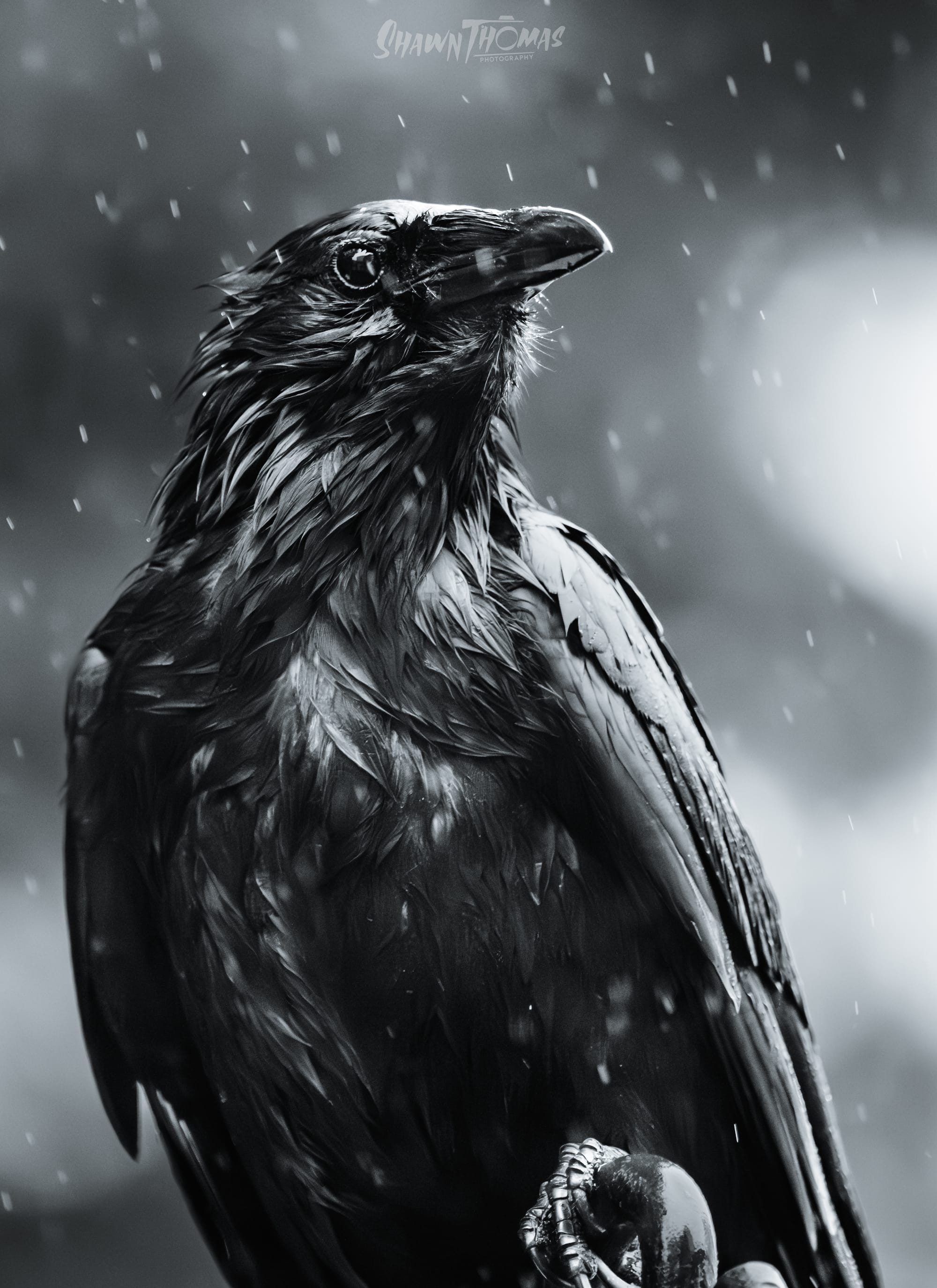
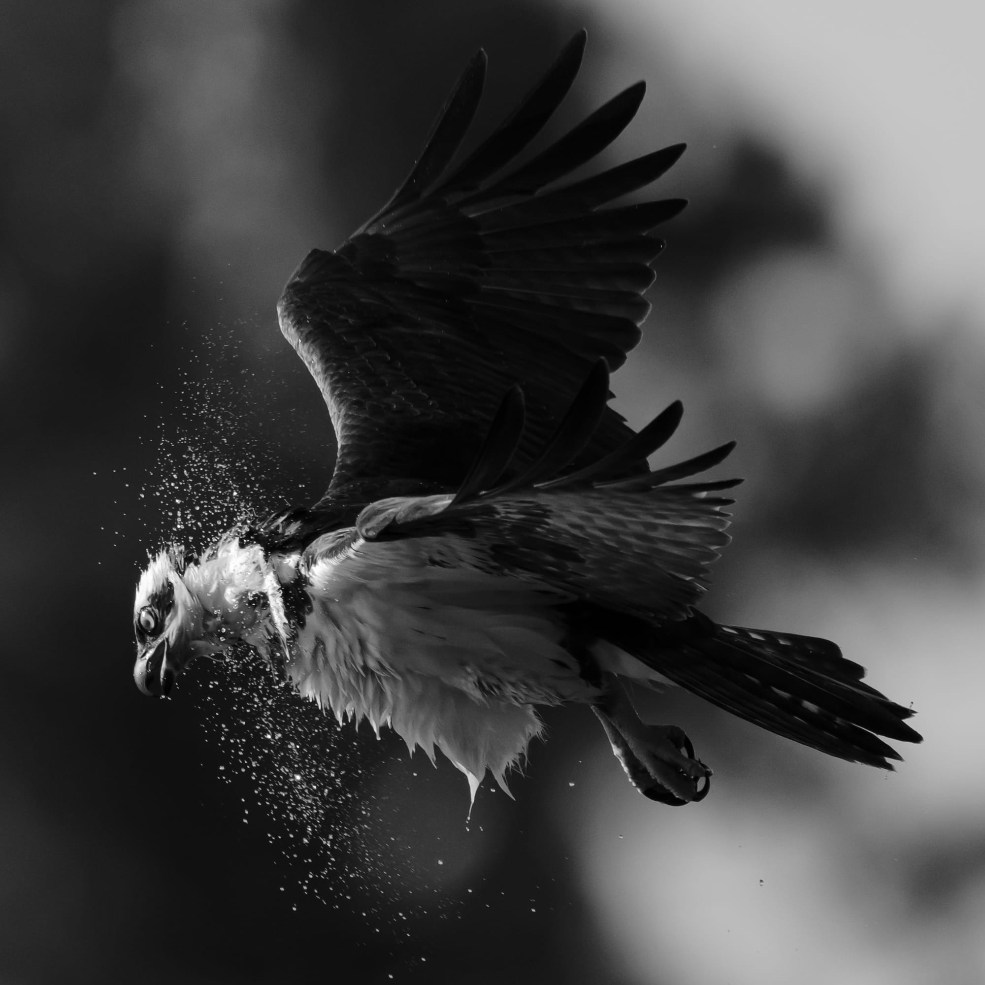
Texture Triumphs: The image needs to be about something tactile. Many of the shots I convert have a water or wet element, or are very high contrast in some way. This crow in the downpour, his name is Phish by the way and he is my wife's friend, isn't about color; it's about the wet feathers and how the backlight reflects off them, and streaks of rain, turning the bird into a dark, sculptural icon of resilience against the elements. This was really the first image I felt like I understood what black and white meant to me, and I'll show the color image even if I think it's terrible, just to prove the point.
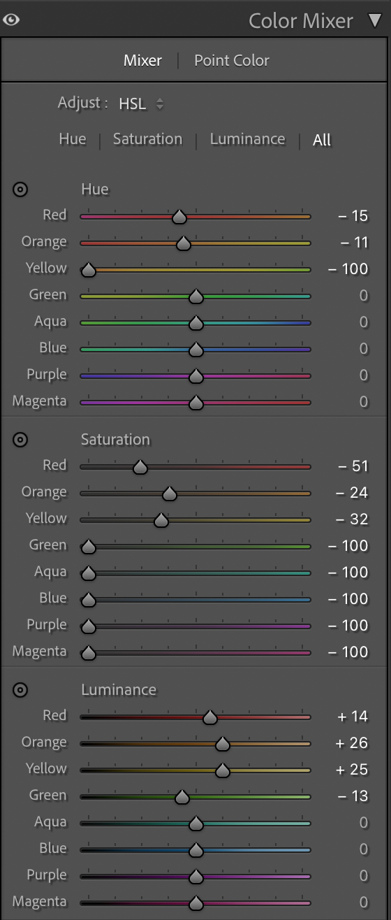
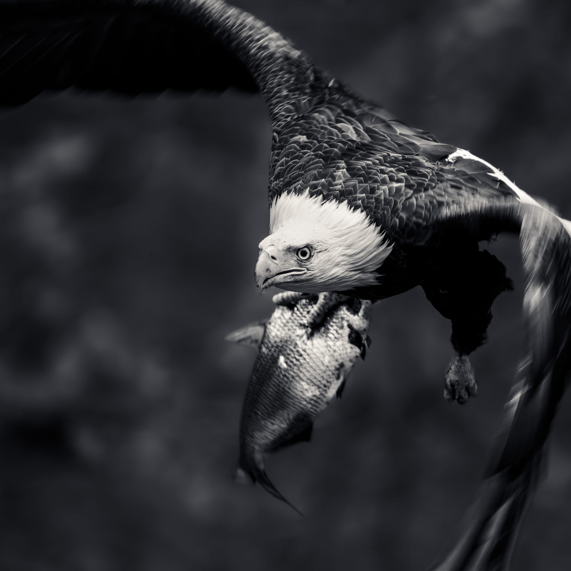
Tonal Separation: I work the color mixer to push hues apart tonally. For example, a blue sky and a dark green forest might look similar in a straight desaturation. But by darkening the blues and lightening the greens (or vice versa), I can create incredible separation and drama that didn’t exist in the color photo. Here is the color mixer on the photo of Phish
The black and white conversion should add something to the image. If the final monochrome image doesn't force a stronger, more emotional connection than the original, I ditch the B&W and stick with the color.
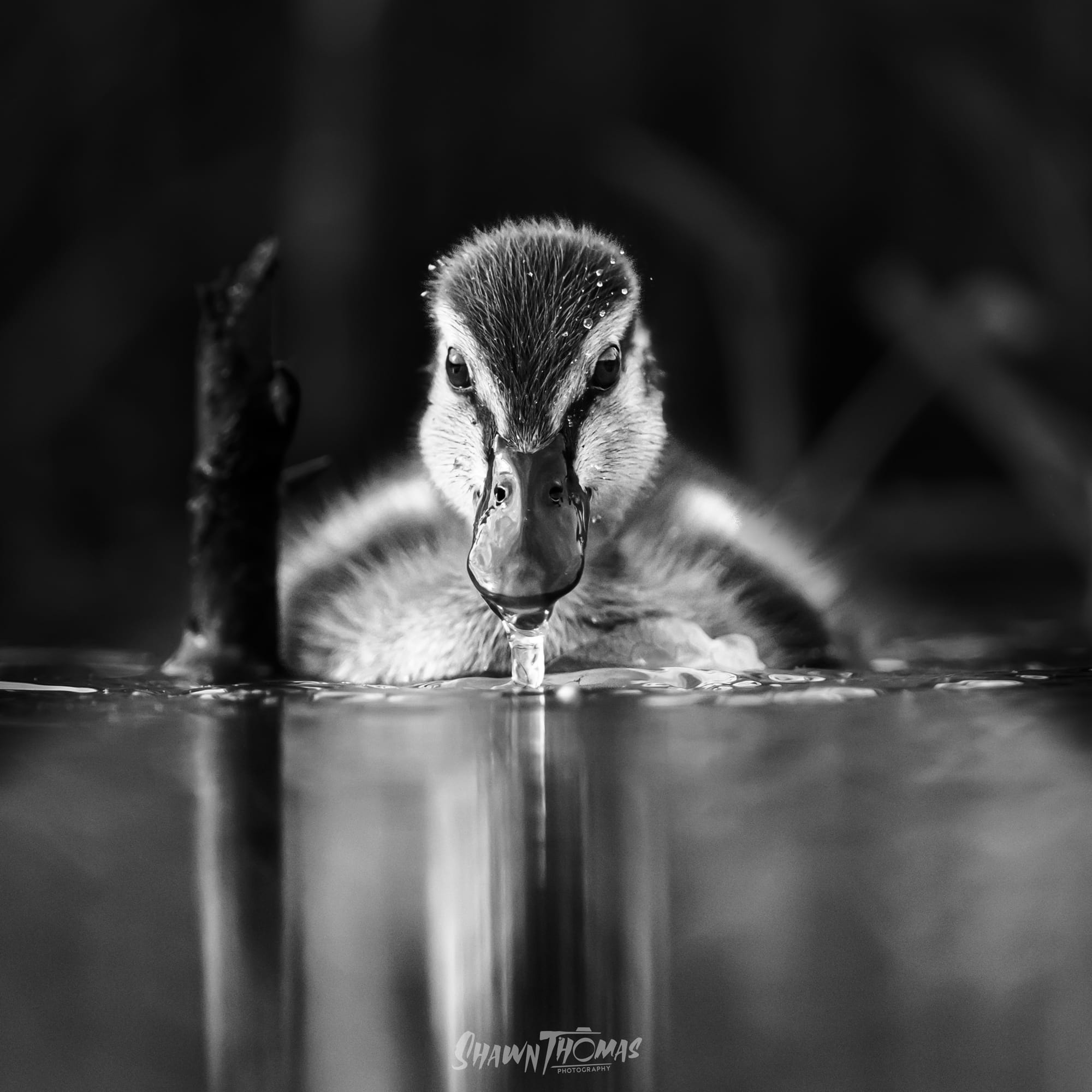
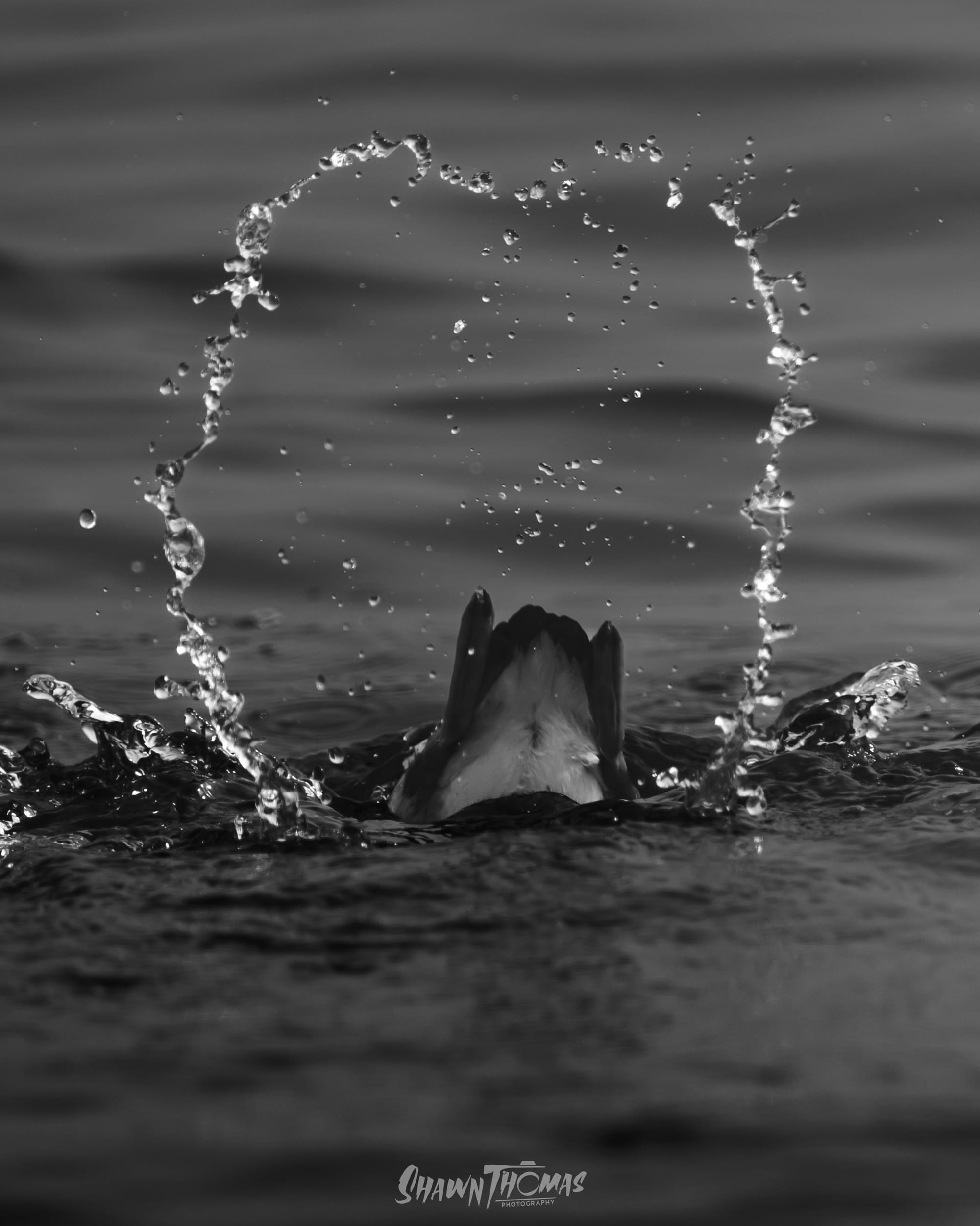
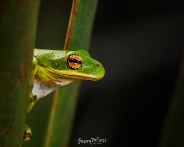
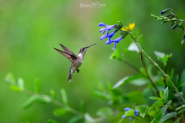
Heres a few more conversions I've come to really like, that I think added to the image overall, for y'all to peruse at your leisure.
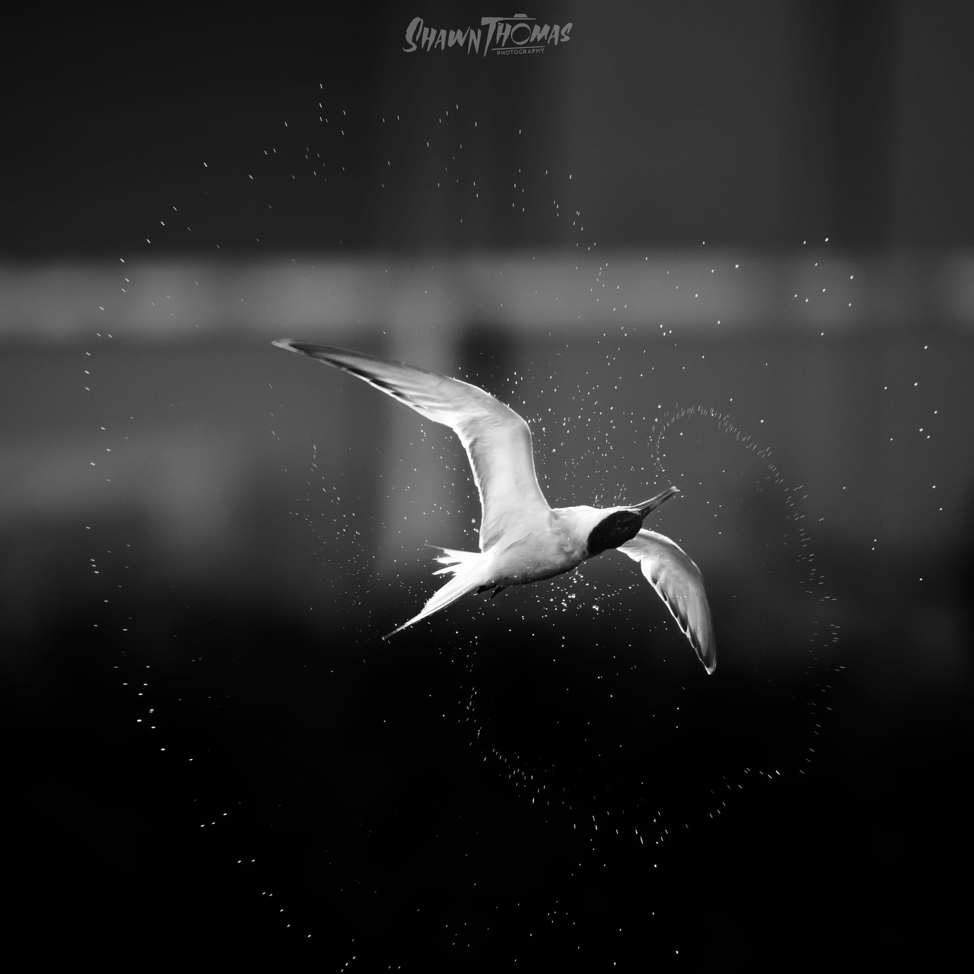
I did say I had a thing for water being involved when I do black and white right?
So next time you’re analyzing a raw file, find the texture, find the high contrast, and ask yourself what the color is truly doing. If it’s just sitting there, distracting, it’s time to commit to the dark side.
Like what you see? Check out my full portfolio for more wildlife and landscape work at www.shawnthomas.art. And why not subscribe? I post new thoughts, tips, or adventures every Tuesday.
Sign up for Shawn Thomas Photography
Wildlife, landscapes & the stories behind the shots. New posts every Tuesday.