Lets Edit a photo - Building the Background (Part 1)
How I edit a wildlife photo, Part 1: building the background. 11 masks, no global sliders, and why the most important step is setting up your baselines first.
I thought today we'd walk through the editing process of a wildlife photo, at least how I approach it. Fair warning, my editing is complicated and simple at the same time, and that's the thing I want you to see most.
A few things about how I work, up front, and you'll watch all of these play out as we go:
I make very few global changes. Almost everything is hyper-localized masking.
I almost always edit the background first, before I ever touch the subject.
I try to keep things in the realm of real, with just a little magic.
And maybe the most important one, my edits are made of lots of small subtle moves, not one big sweeping one.
For me, editing isn't fixing the image, it's finishing it. It's continuing the work the light started in the field, light shaping, just at a different point in the process. That framing is going to drive everything below.
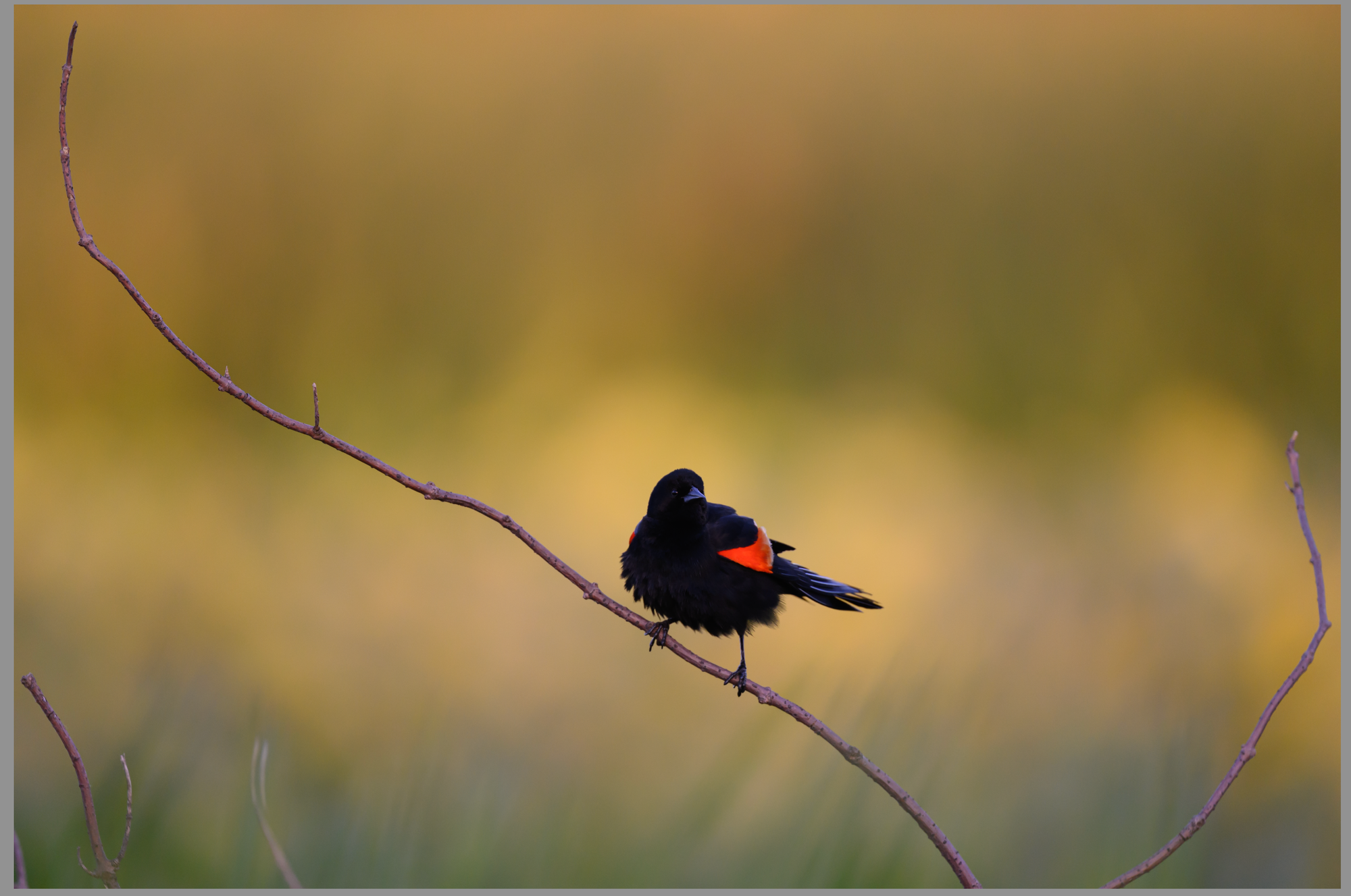
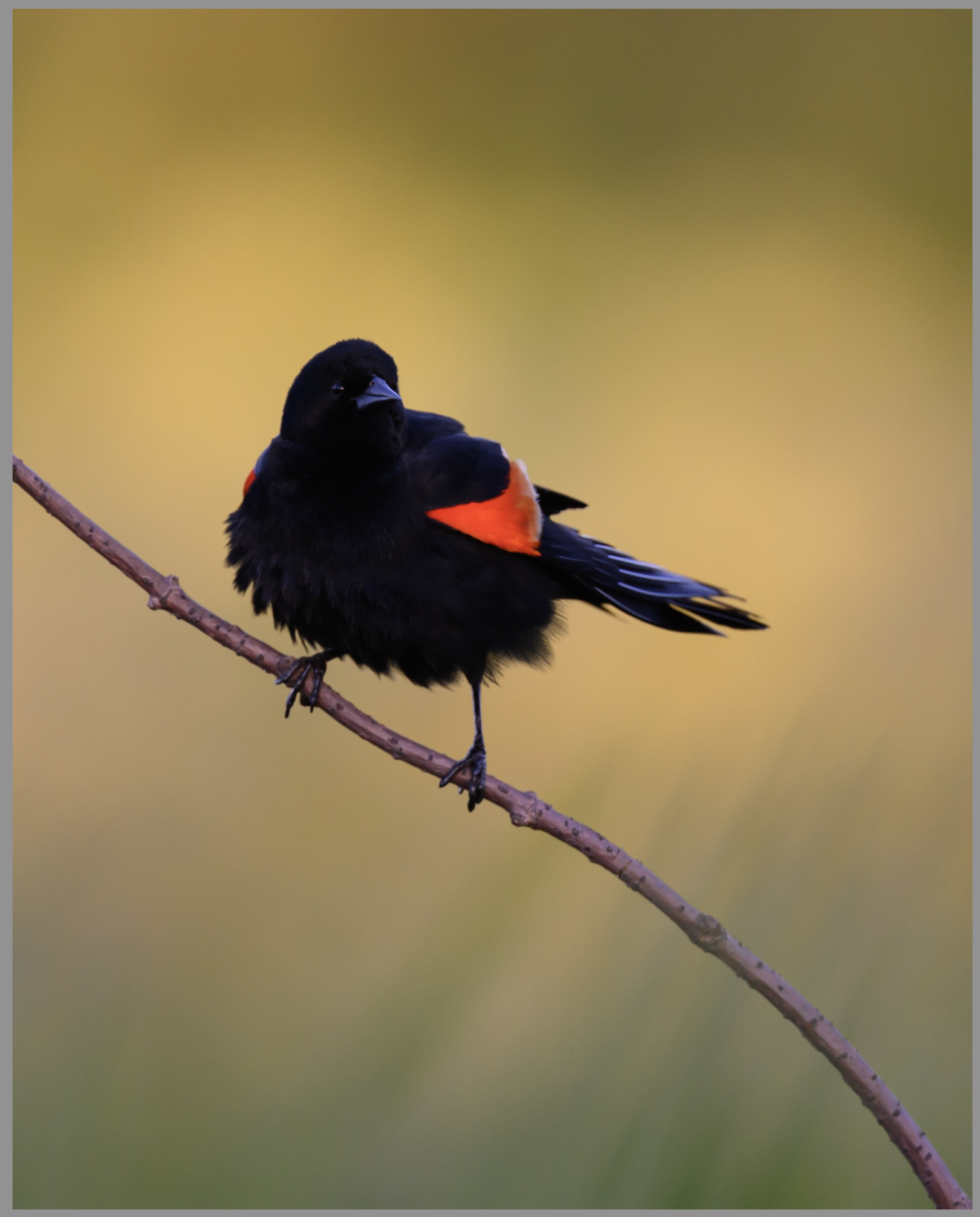
For this exercise I picked a relatively fine image I took the other day. Let's see if we can make it a bit more special.
Just a regular, common red-winged blackbird, but the sunset here was special. We've got light behind the subject without directly illuminating him, which gives us a beautiful golden background to play with and some subtle texture in the grasses behind him. Ultimately it's still a bird on a stick, nothing too special. So let's get to work.
Step 1: Find the Image Inside the Image
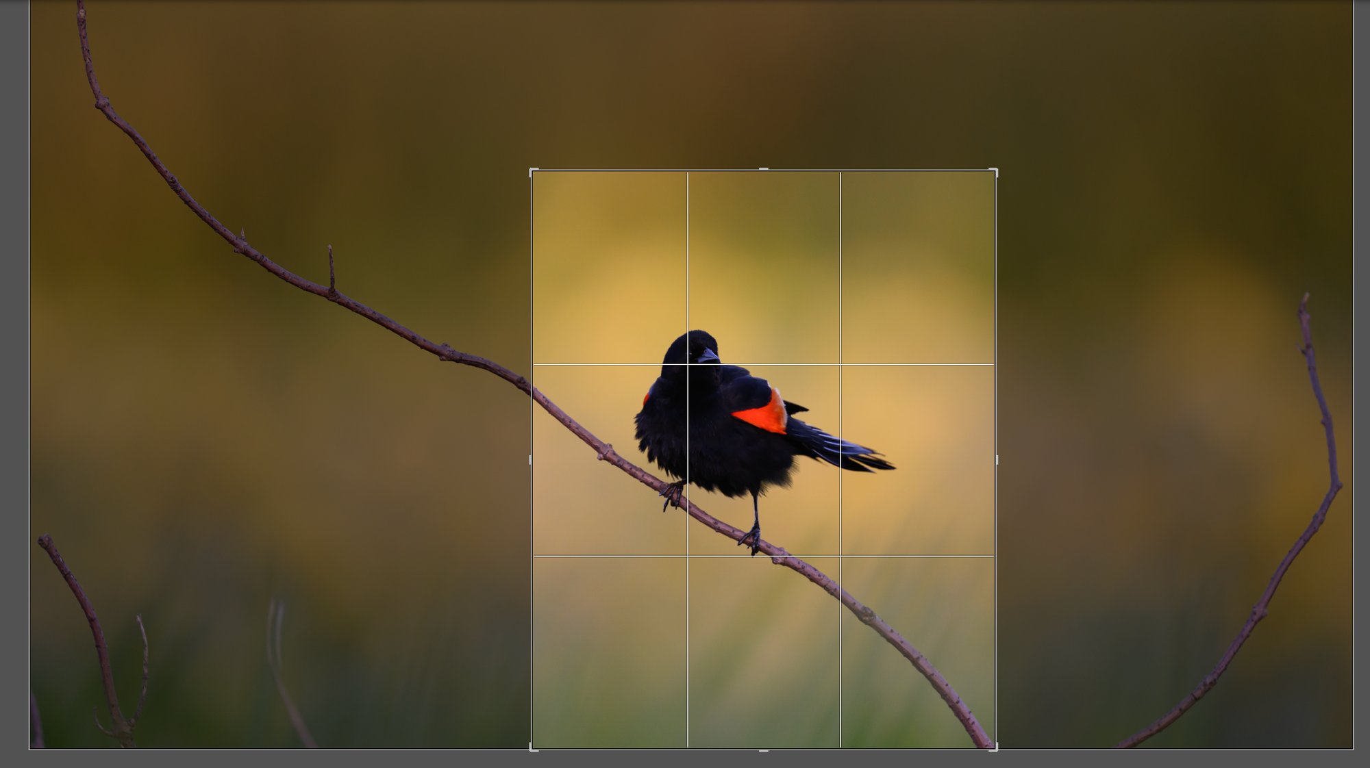
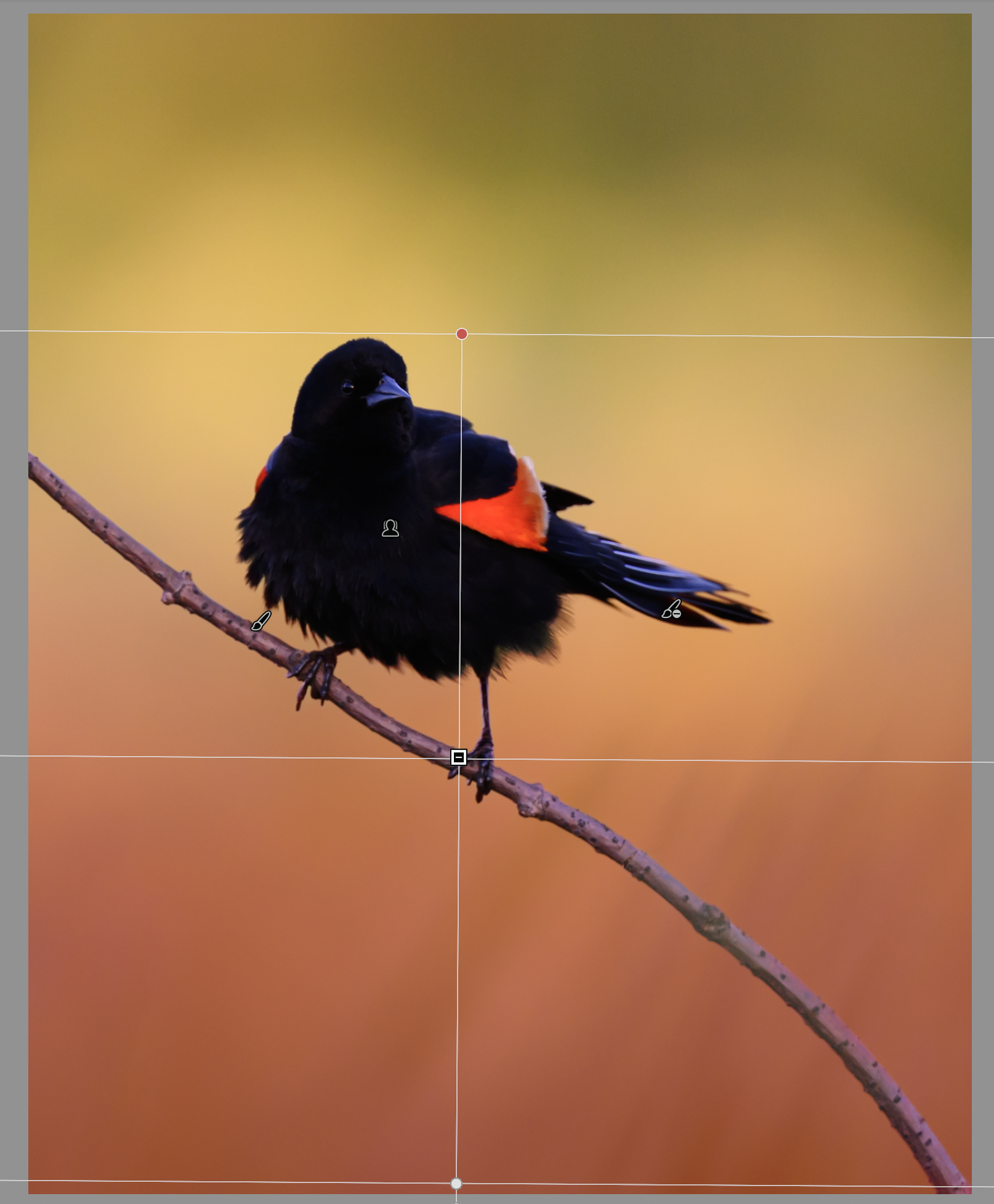
Step one is finding our image inside the image. The full-frame shot is fine, but the bottom-left has some distracting branches, and while I like space, this space isn't serving the story. So let's try a crop.
I've been working a lot in 4x5 lately. It's more natural for my printer, and I like the slightly squarer look. A few notes on how this crop landed:
I often like to have a branch entering the frame from a corner. It's a preference, but I think it creates a leading line into the image. I also favor setting the subject's eye on a third line, often close to the upper-third or right-third intersection. That creates space and dynamism. I find most center-weighted images without symmetry to be boring and static, so I work along the thirds to keep that from being an issue.
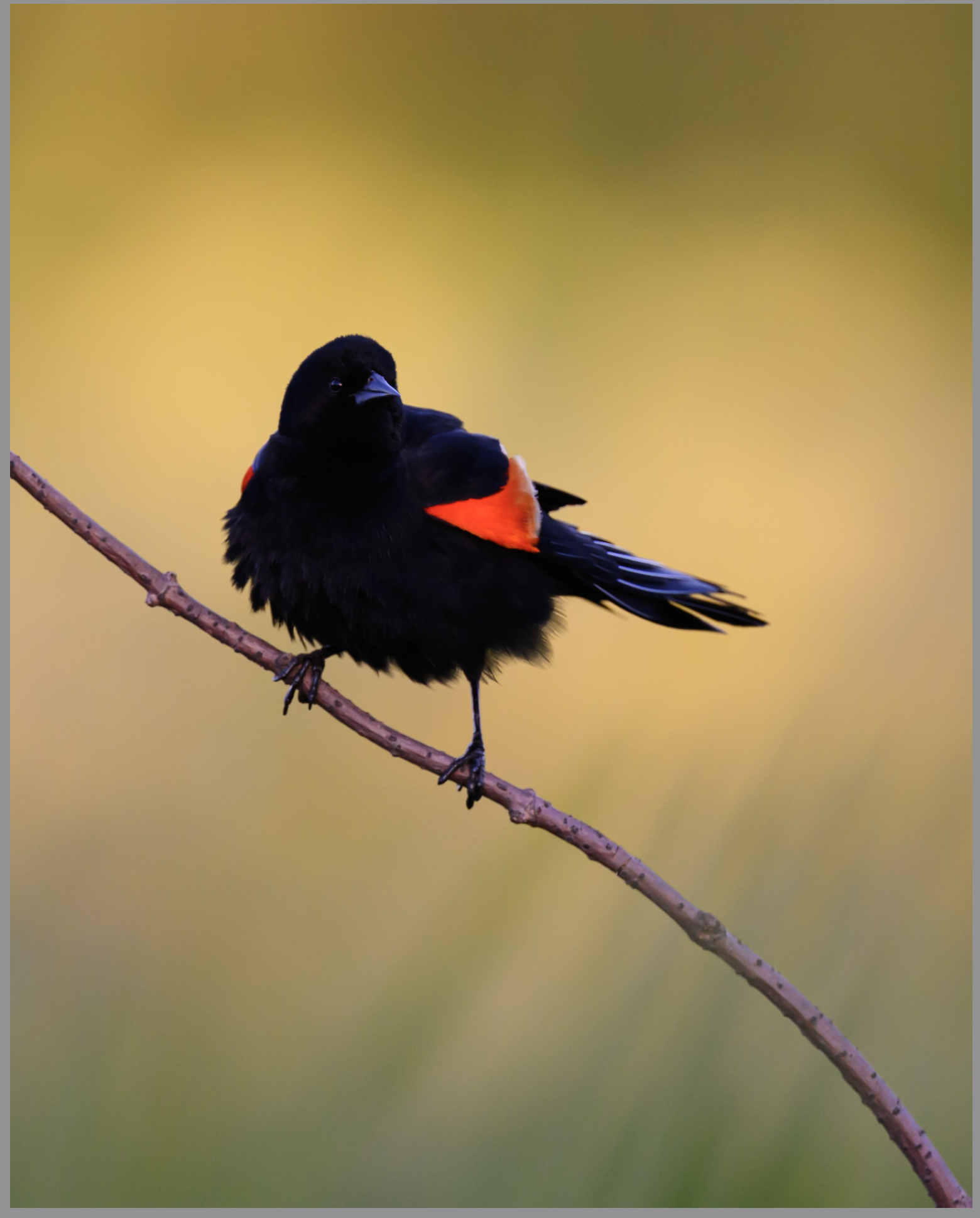
Here's our finished crop:
Not bad. We still have that nice fluffy bird, the color pops, and the background is intact with the green grass at the bottom fading up into gold.
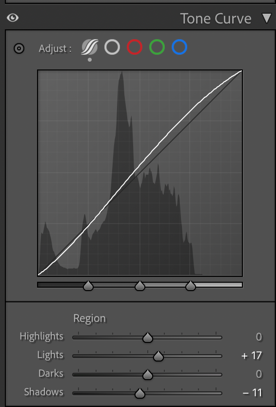
Step 2: A Light Global Touch
The first thing I almost always do is add a subtle tone curve, lower the shadows just slightly and lift the highlights. It gives an image a cinematic look. Here's what that looks like:
This is to taste, and every image is different. Here's the result:
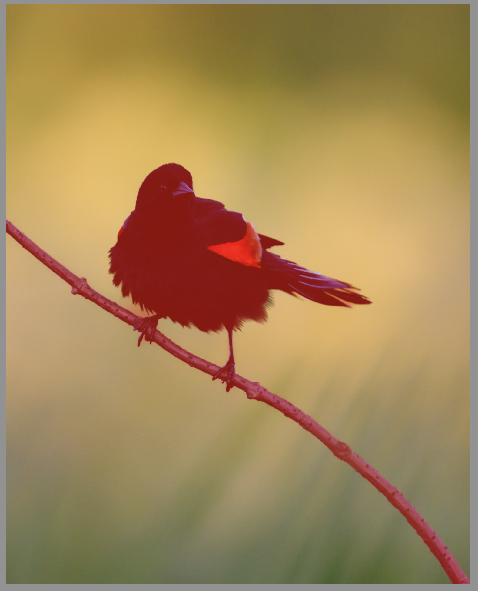
Obviously we just made a dark bird darker. Don't worry about that for now, we'll absolutely get to him later. Right now I'm setting the room the bird lives in, not the bird himself.
This, by the way, is the only real global change I'll make in the whole post. Everything else is local.
Step 3: Build Your Baselines First
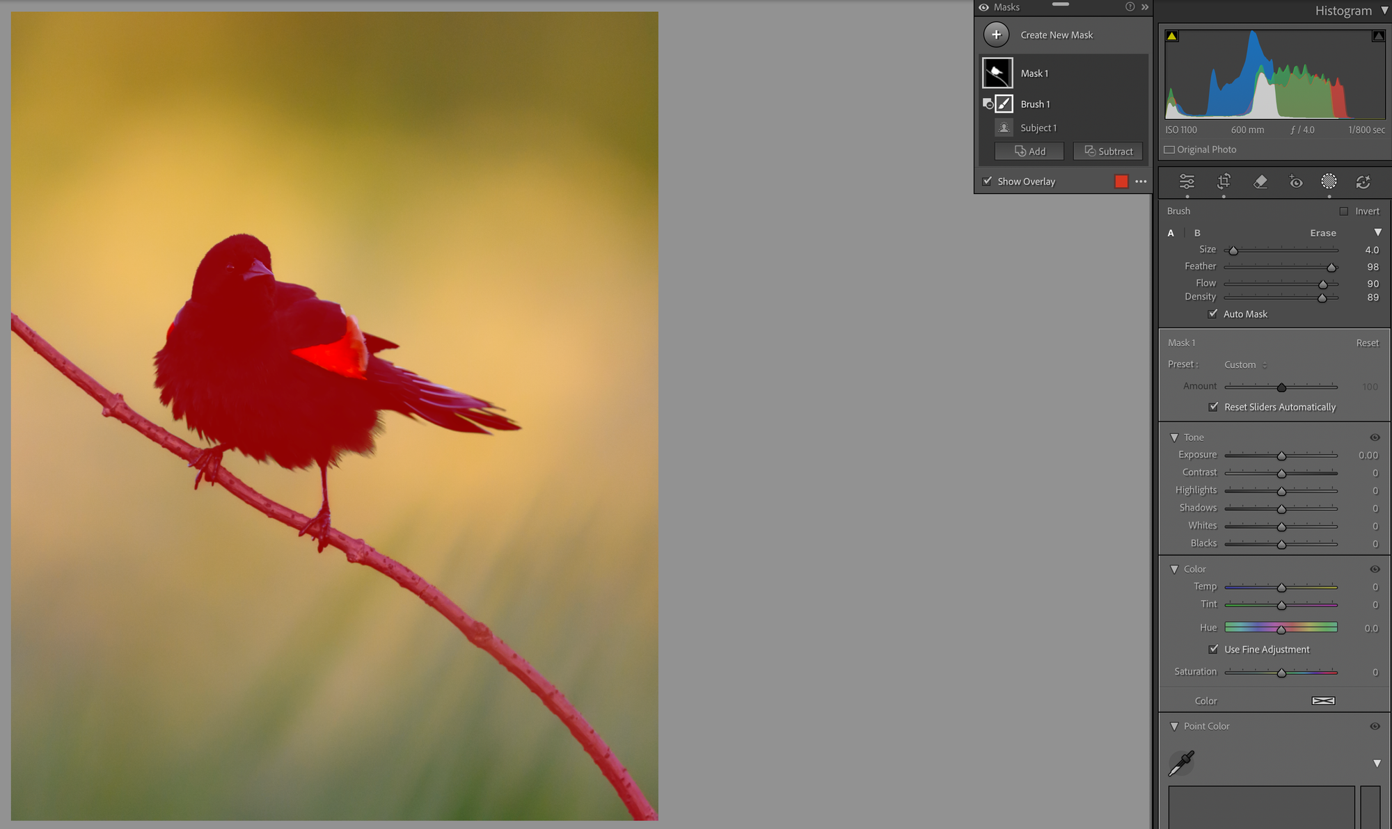
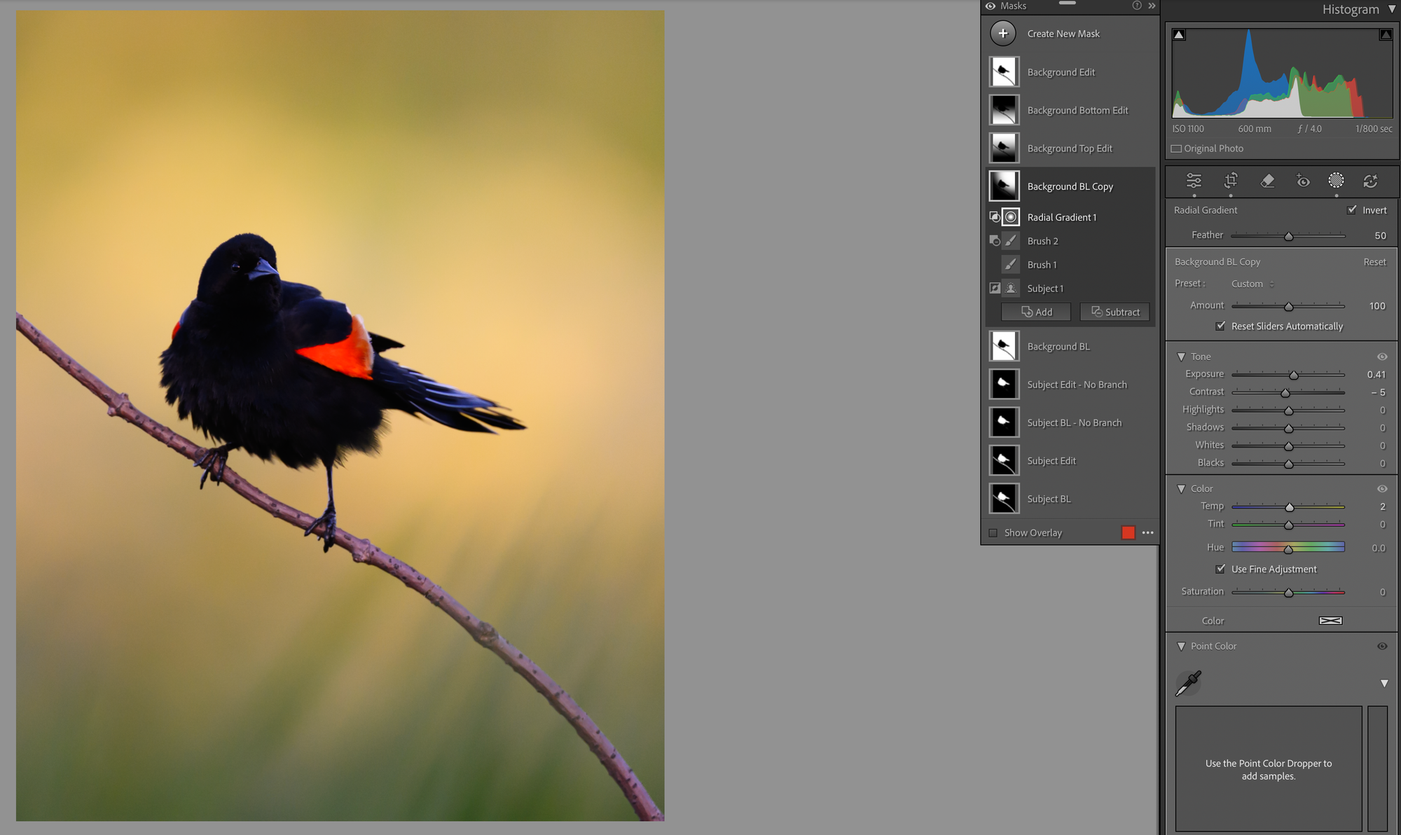
Now we set up our masking structure. I'll start with a subject mask, perfect it, and then invert it to make a background mask. We won't actually edit either of these. They're our baselines, the foundation every other mask is going to be built off of.
Subject-detection masking is amazing, but you can see here it's far from perfect. We'll need to clean it up with a brush.
Make sure auto-mask is selected when you're cleaning up. You can see it called out on the right. It'll constrain your brush and help you follow the lines.
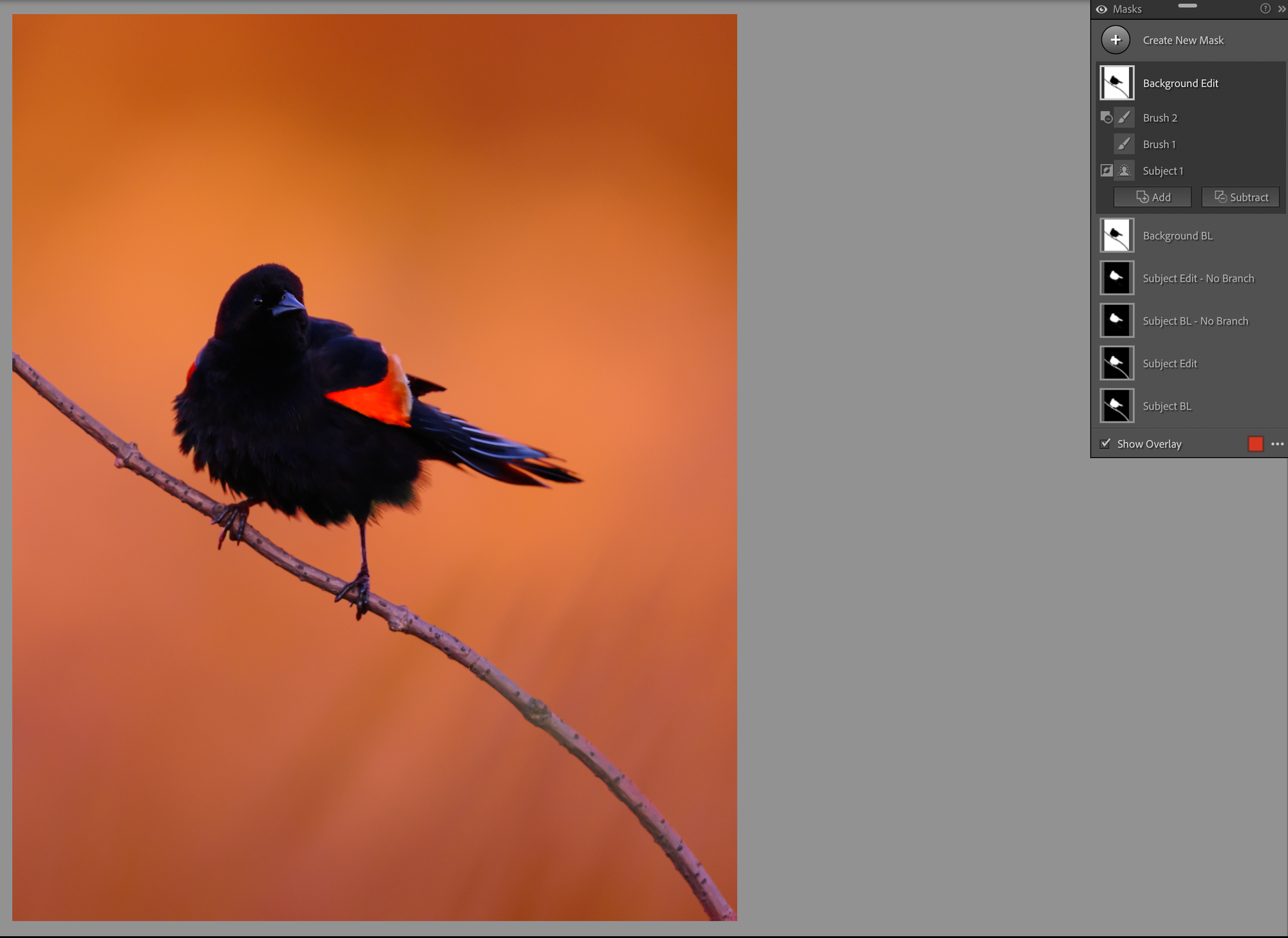
Now that we have a clean subject mask, we'll invert it and duplicate it a few times. I'll want one version that includes the branch and one without. I don't usually name my masks, but I'm going to for this walkthrough so you can follow along.
Six masks before we've started editing anything. If you take one thing away from this post, this is it: build your baselines first. Every gradient you make later is going to start from these. You need that consistency or the whole stack falls apart. Build your baselines, then work from inverses and copies of them. It will make your life so much easier later on.
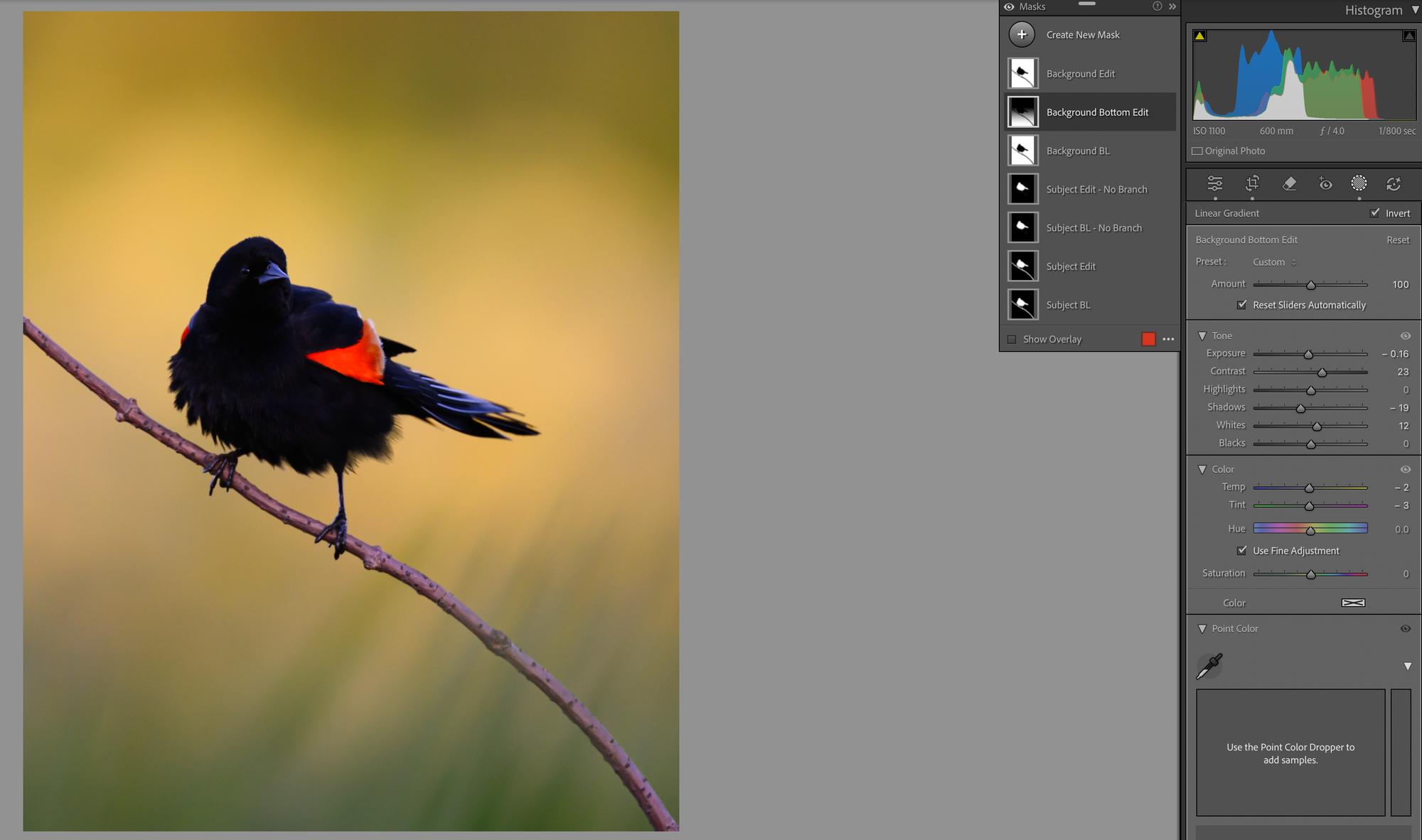
Step 4: The Bottom of the Frame
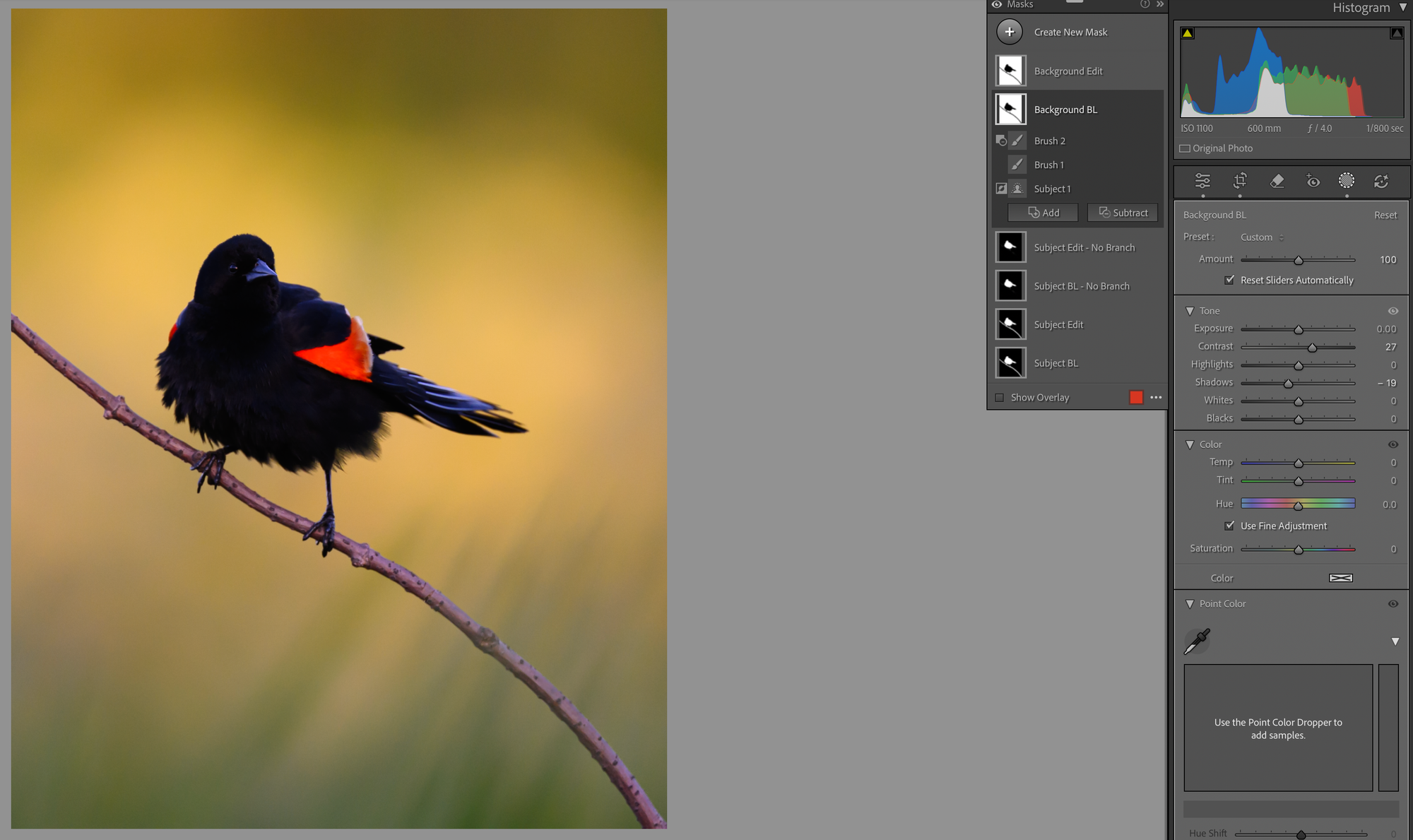
Like I said, I like to start with the background. What I want to do here is emphasize the grass transition, that soft bokeh in the lower frame, and pull a little more out of the color that's already there.
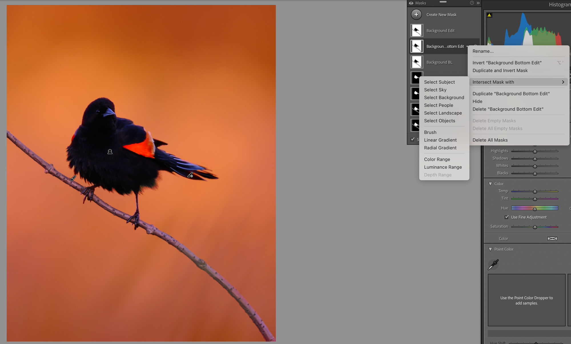
And here's where the baselines pay off, earlier than I thought. (I'm editing this in real time while I write, so I'm making decisions as I go.) Adding a little contrast and dropping the shadows does emphasize the grass, but it makes the top of the frame too heavy. I want the top to stay dreamier. So I'm going to back this off, create a new copy of the background mask, intersect it with a linear gradient coming up from the bottom, and focus the change on just the lower half. The top half I'll handle separately.
Here's how you do it. Take your baseline copy, choose "intersect mask with," and pick your gradient. I use this all the time. Linear and radial gradients are a huge part of how I work, because they let me make focused changes that softly fade across the frame instead of stopping at a hard edge.
You can see the new overlay in red. That's the region where my adjustments will apply, fading out as it goes up. Now I can give the image a little more bottom weight and emphasize the grasses without touching the top.
Here's the side-by-side. It's subtle. But that's the whole point. A good edit is a lot of small subtle moves, not one big sweeping one.
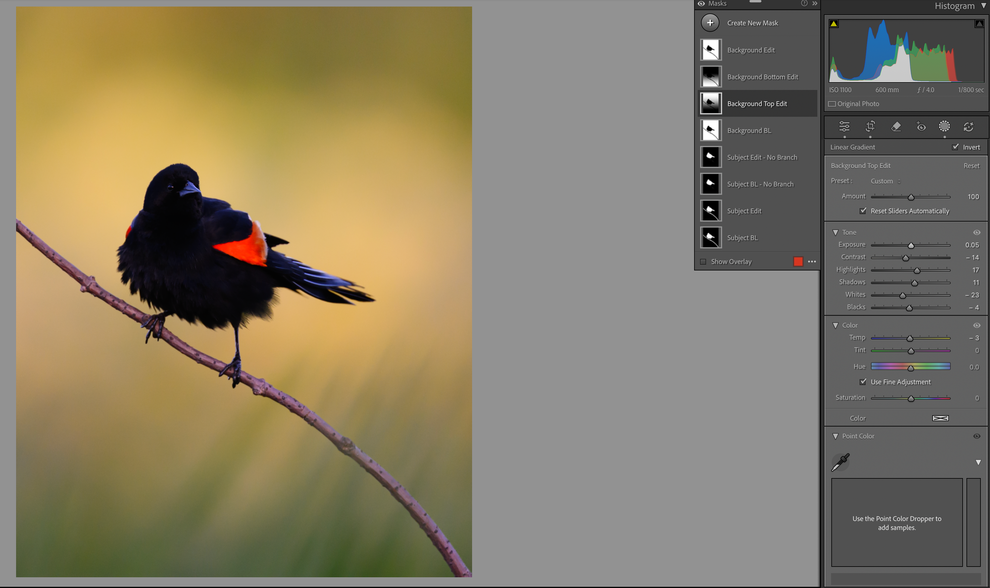
Step 5: The Top of the Frame
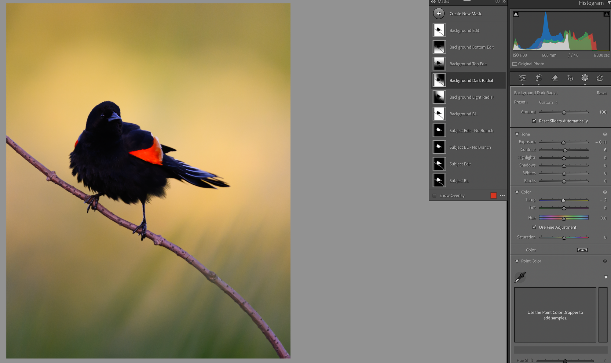
Now the top. Those colors are amazing, but I'm finding them a touch too much. So I'll repeat the move, copy the baseline, intersect with a linear gradient, this time coming top-to-bottom so I can work the upper frame in isolation.
What did I do? Lightened it just a touch. Lowered the contrast a bit. Gave it a little more highlight and shadow detail. Blended it all together a hair more. And since it was already very warm, I actually dropped the warmth slightly. Before and after:
Step 6: A Custom Vignette
Another thing I love to do is build my own vignettes instead of using the global one. I'll intersect the background with a radial gradient from a corner and brighten it just a hair. Then I'll invert that, mask the subject back out, and darken the rest of the frame a little to make the bright spot pop.
For this image I wanted to keep it pretty light, so just -0.11 on exposure and -2 on temp. There isn't a science to this and I don't sell or use presets. Each image kind of tells me what it wants as I'm editing. I experiment, I go back and change things across masks all the time, but I treat each scene as its own thing even when I'm reaching for techniques I use a lot.
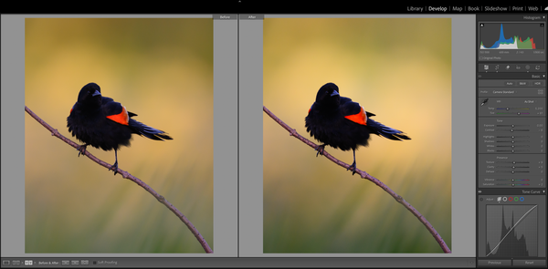
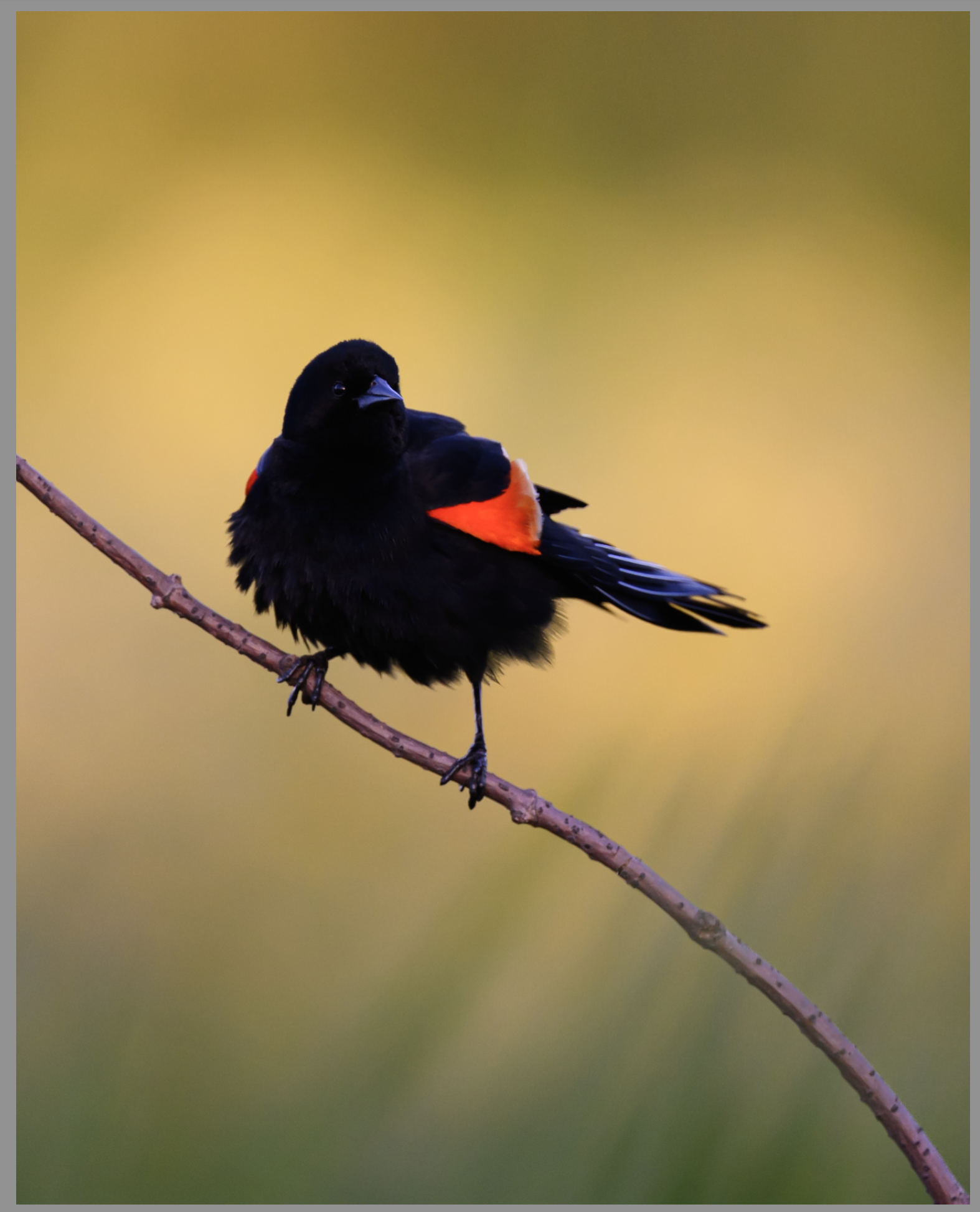
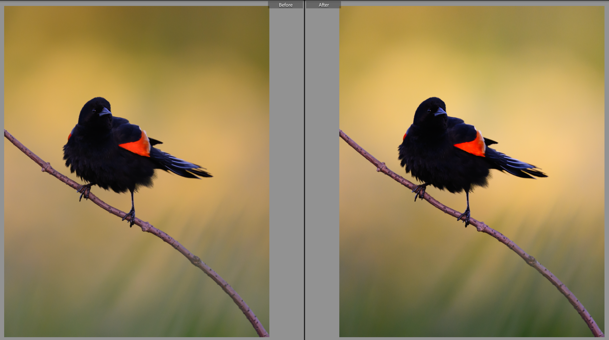
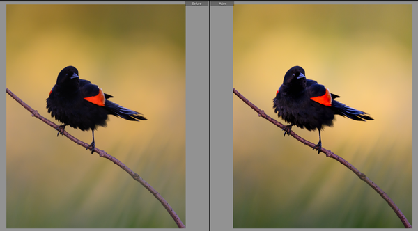
The background is looking pretty good. And we're at ten masks before we've ever touched the subject. Crazy to think about. Here's a before-and-after on the background work as a whole before we dive into the bird next week:
It's all subtle. It's all intentionally subtle. But like I said up top, a ton of small subtle choices is what goes into making an image feel finished. And before you tell me that's too much work, if I wasn't writing this blog while editing, this whole thing wouldn't have taken me more than five or ten minutes.
We're at about 1,300 words, so I'll break this up here. Join me next week when we finally get to our subject and the overall finish. Until then.