Lets Edit a Photo - Finishing the Subject (Part 2)
Finishing a wildlife edit in Lightroom across 14 masks, working the subject, eye, and branch. The lesson: subjects pop from the light around them, not the slider.
Alright, we're back. For you it's been a week. For me, about five minutes. While you're reading this I'm actually moving to a new condo, so I've prepared the rest of this story in advance.
Where we left off with our red-winged blackbird was eleven masks of just baselines and background work, bringing weight to the bottom, creating air at the top, and a custom vignette to shape the light. If you haven't read Part 1, go give it a look first, this one will make a lot more sense after.
Today is about the bird and the finish.
Lift the Subject
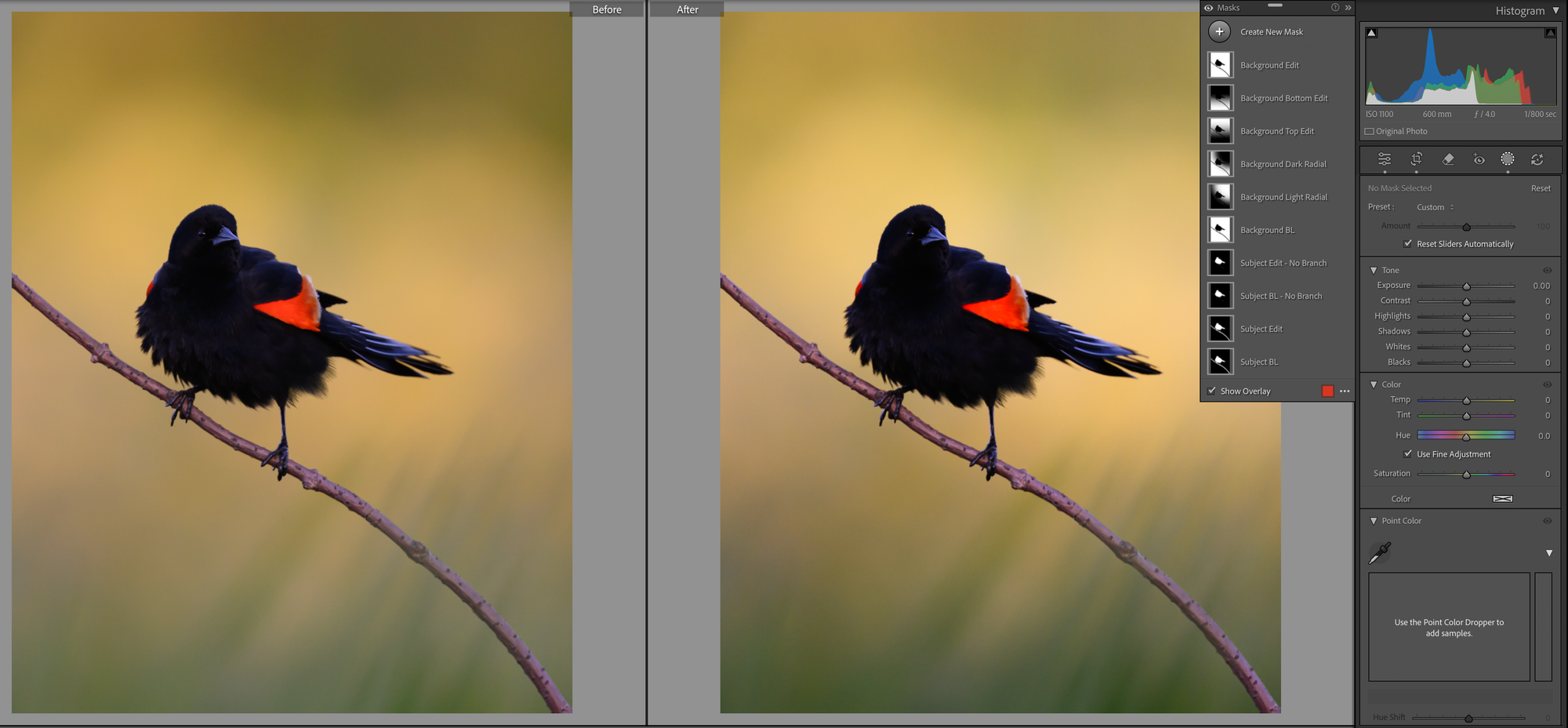
Remember in Part 1 when the tone curve made our already-dark bird darker? Time to fix that. A shadow lift to bring him back.
A red-winged blackbird is a dark black bird, so I don't want to lose that. I just want to bring in a little pop and definition. One of my favorite techniques for this: up the exposure, contrast, and shadows, while lowering the blacks. That keeps the darkest parts inky while pulling texture into the rest of him. You can also see I added a little temperature, since he was sitting in shadow and reading slightly too blue for the scene.
One important note. I worked the no-branch version of the subject mask we built in Part 1. I don't want the branch to act like the bird. The branch gets its own pass, with its own intent.
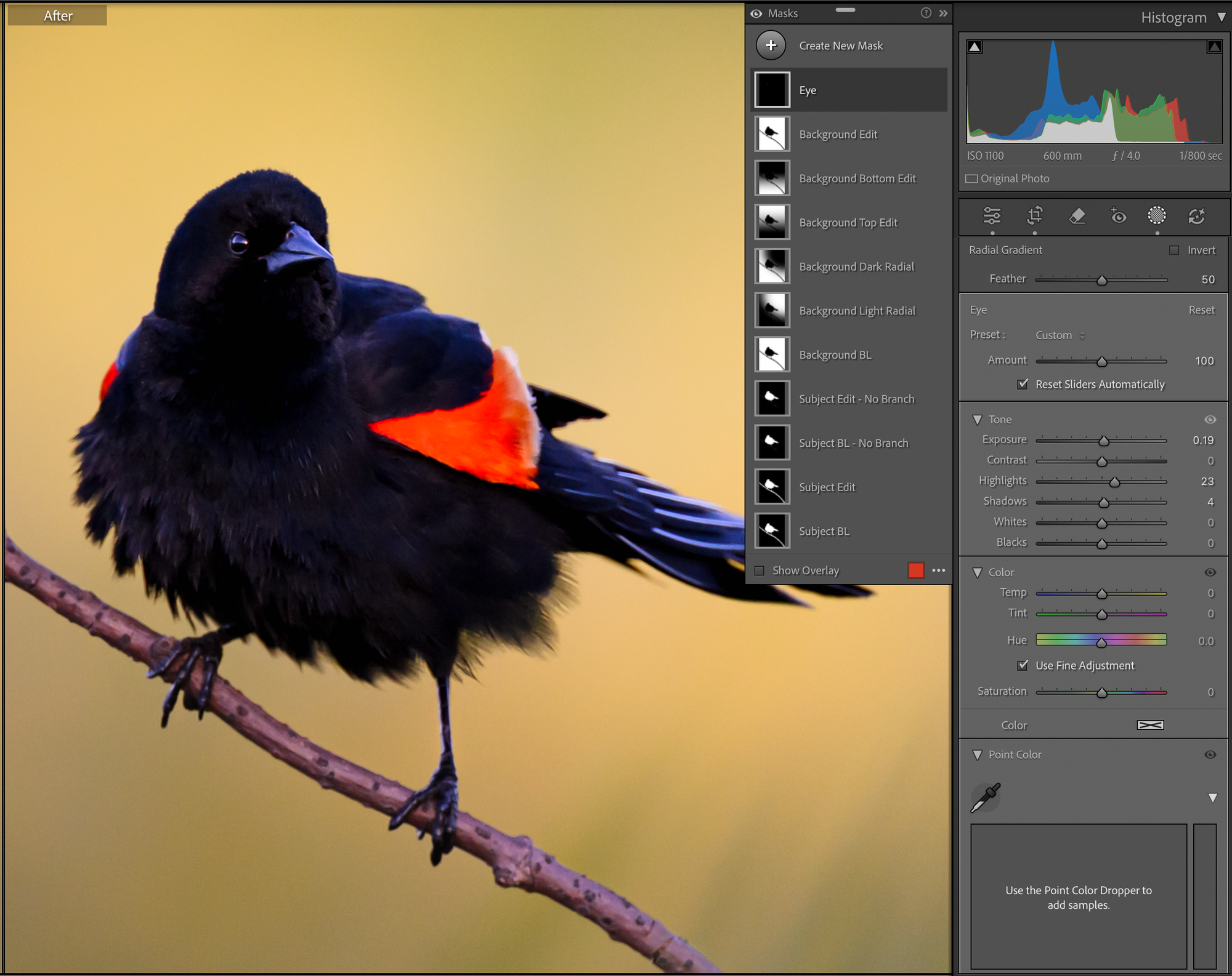
The Eye
The eye is one of the most important parts of any wildlife photo. We've already got a really nice catchlight here, but I want it to pop just a bit more.
There are a few ways to do this. You can use a brush, or you can drop a very small radial gradient like I've done. From there I slightly boost the exposure and raise the highlights and shadows a touch. The highlights raise might seem weird for a black eye, but it's there to push the catchlight, not the eye itself.
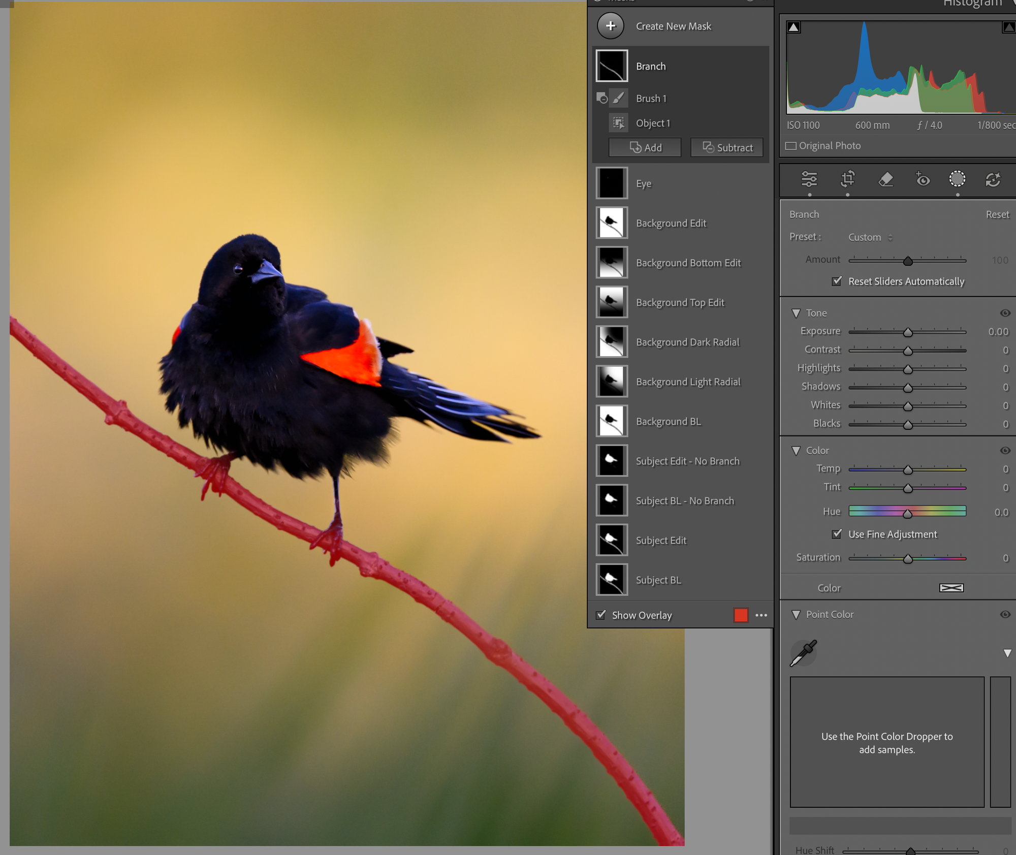
The Branch
Now the branch, and we'll handle it with object masking. Create a new mask, choose object mask, paint roughly over the branch. Don't try to be precise. Let the tool do the selection.
I subtracted a brush stroke around the feet to clean up the edge, and the tool did the rest. I've found object masking is genuinely good on simple shapes like this.
Now I want this branch to be a grounding force for the image, not just something the bird is standing on. So I lowered the exposure a bit, dropped the shadows, added contrast, raised the highlights for some shine, and added a little warmth. I also added a touch of dehaze, not visible in the panel here since it's further down the toolbar. Dehaze is great for crisping up a single object like this. On atmospheric scenes I'll sometimes go the other way and add haze to emphasize the mood, just depends what the image wants.
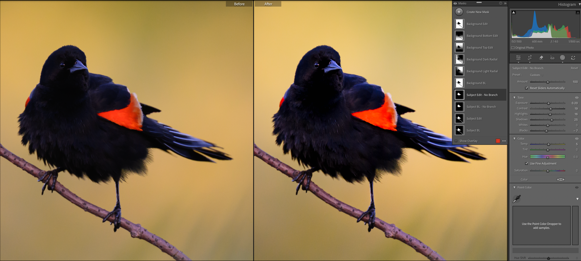
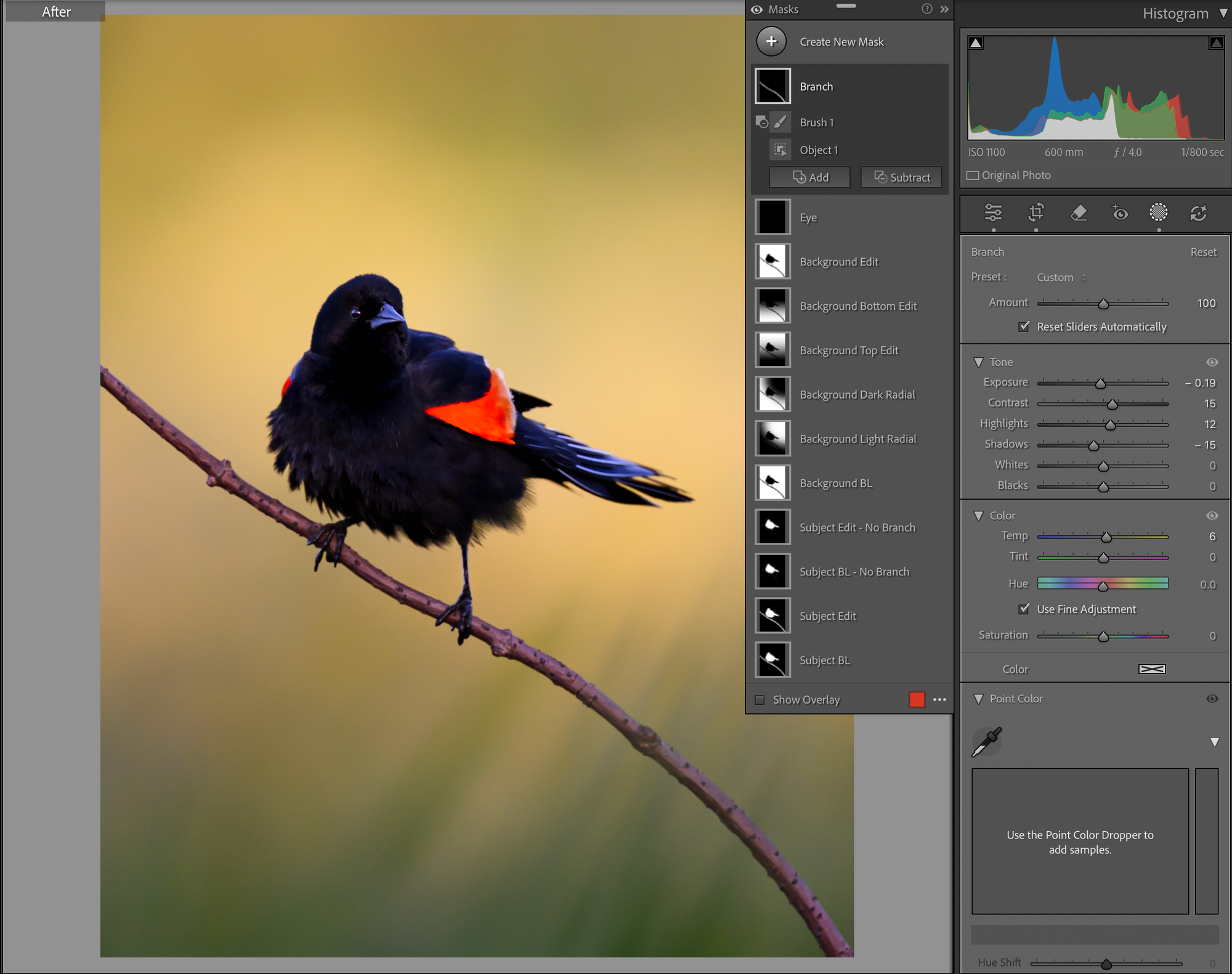
Shape the Bird with Gradients
Just a little more shaping and we're done. Back to the baseline masks for some gradient work.
I'm going to use a left gradient to focus on the bird's head and chest, and a right gradient as the inverse, exactly the same intersect-with-gradient move from Part 1, just applied to the subject instead of the background. On the left (head and chest) I'm going to lift the exposure a touch, raise highlights and shadows, and add a little warmth. On the right, I'm going to do the opposite, drop the exposure, cool the temp, lower the highlights and shadows.
This creates a 3D pop effect, the light side gets lighter, the shadow side gets darker, and the bird suddenly has form instead of being flat. Same principle as Part 1 actually, you don't make the bird pop by adding to the bird, you make it pop by shaping the light around the form he already has.
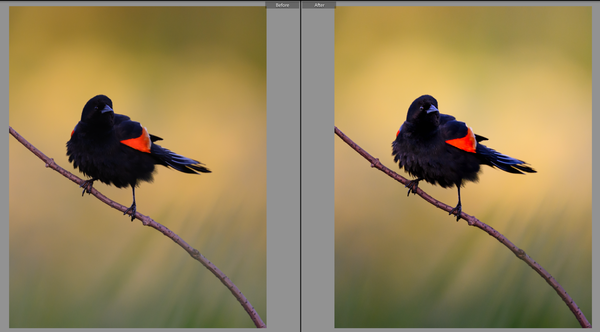
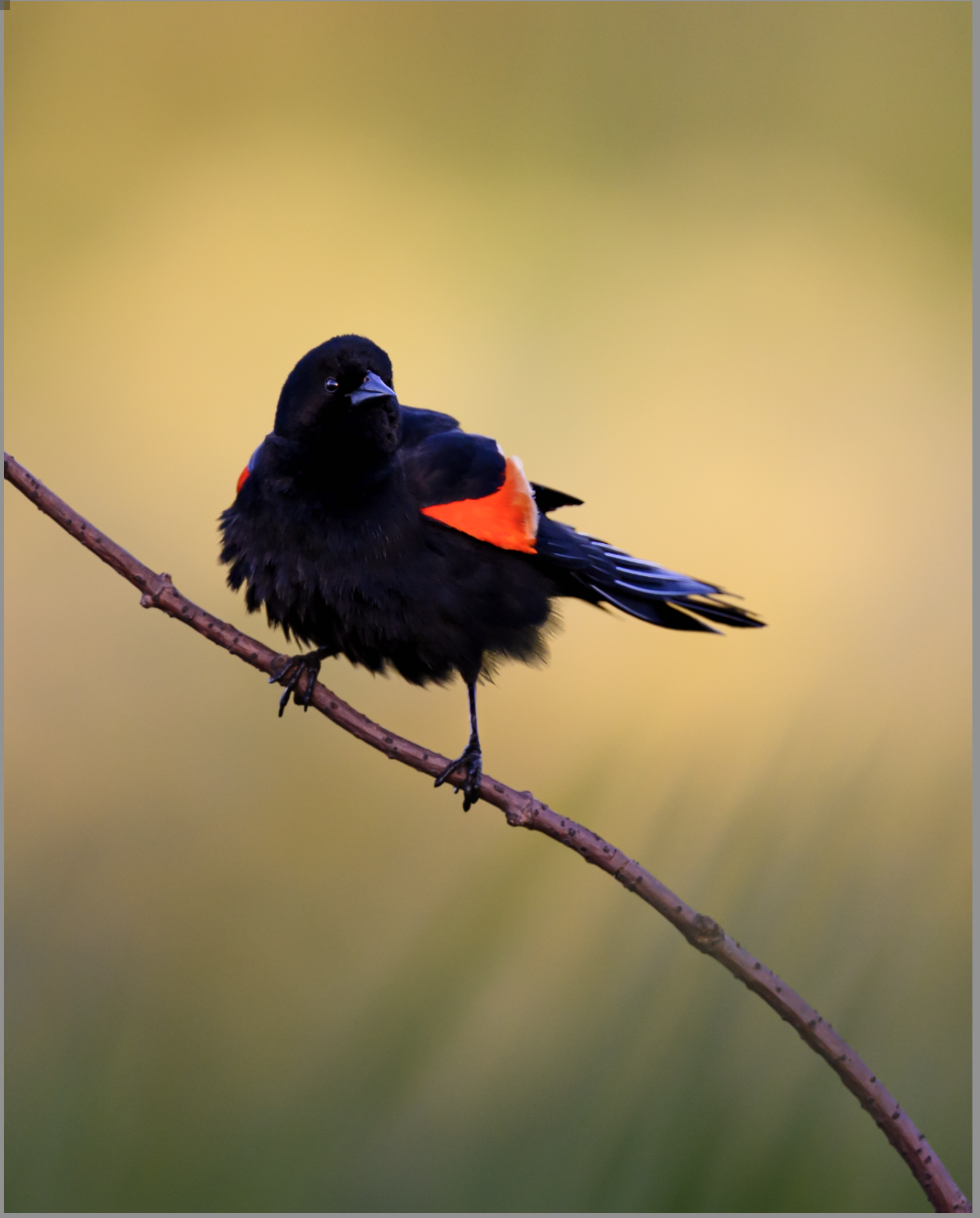
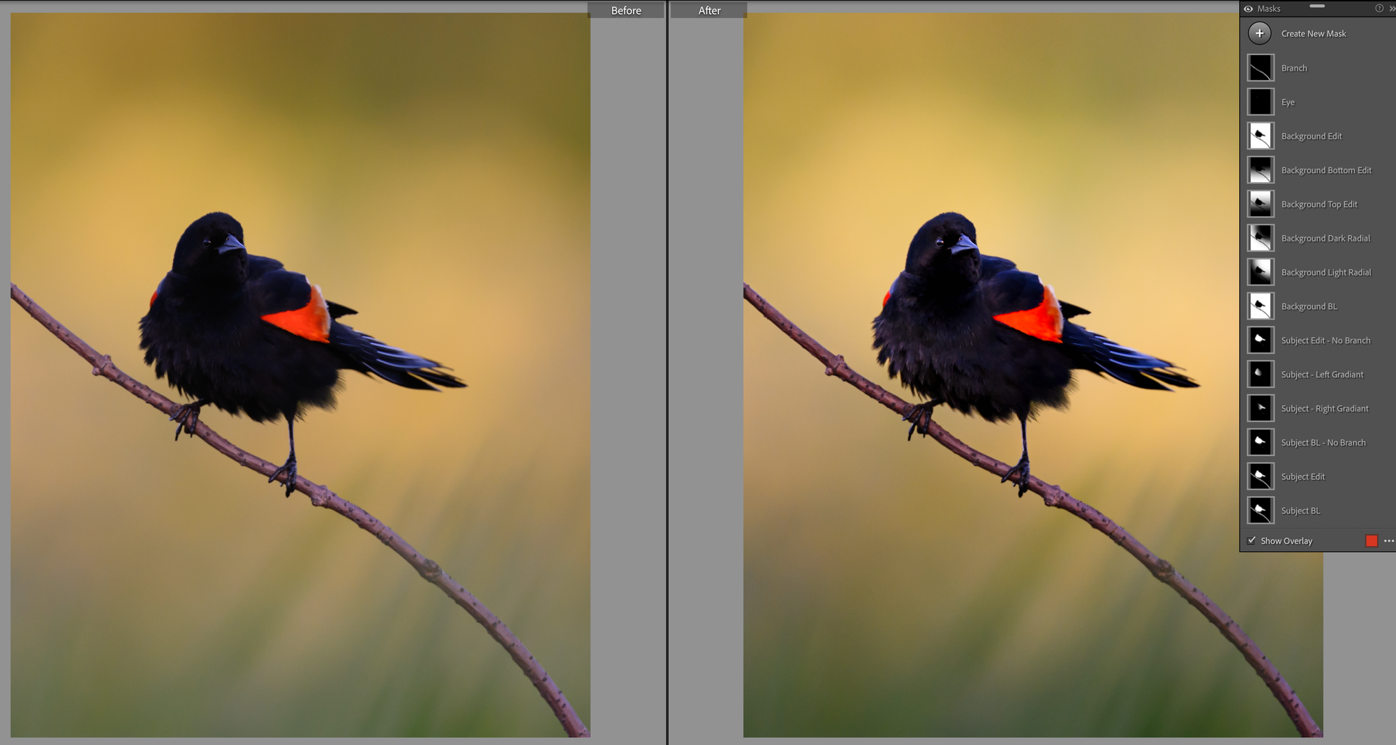
The Whole Edit
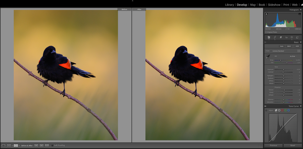
And there we have it. Fourteen masks. A ton of subtle micro-changes across the frame. Here's where we started and where we ended:
Like I said last week, it looks like a ton of work, but once you start to see what you're looking for, this whole process only takes ten to fifteen minutes.
Here's the thing I want you to really notice though: not once did I touch saturation, vibrance, or sharpness.
I'm not saying I never do. But it's pretty rare. I edit images for print, not screen, and I'm not interested in making oversaturated, oversharpened images. I like subtlety, and I like building the scene from the ground up. Light shaping, not slider cranking. I'm not telling you to edit like me. But hopefully these two posts gave you a few new tools for your toolbox and a different way to think about how you want to approach your own edits going forward.
A few things to remember from this whole walkthrough:
A good edit is a lot of micro decisions that compound.
Build baselines of your subject and background masks first, and work from copies and inverses. It will save you a huge amount of work and headache later.
Edit the background first, then build the subject into the scene.
Subjects pop because of what's around them, not what's in them. Shape the light, don't crank the slider.
Just on a personal note, this process is very dynamic, and much of it is done to taste on an image by image basis. This may have been the most difficult blog I have ever written and I made the conscious decision to approach it with a new image and write it in real time to try to lay out my thought process of how I approach images, its the same reason I chose a mostly unremarkable image with some potential to work from. This was a hard one to write, but it was fun to have to step by step my process like this.
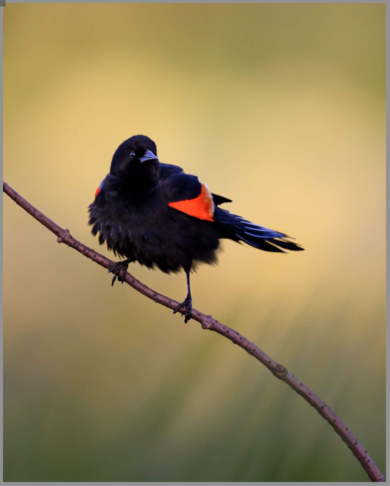
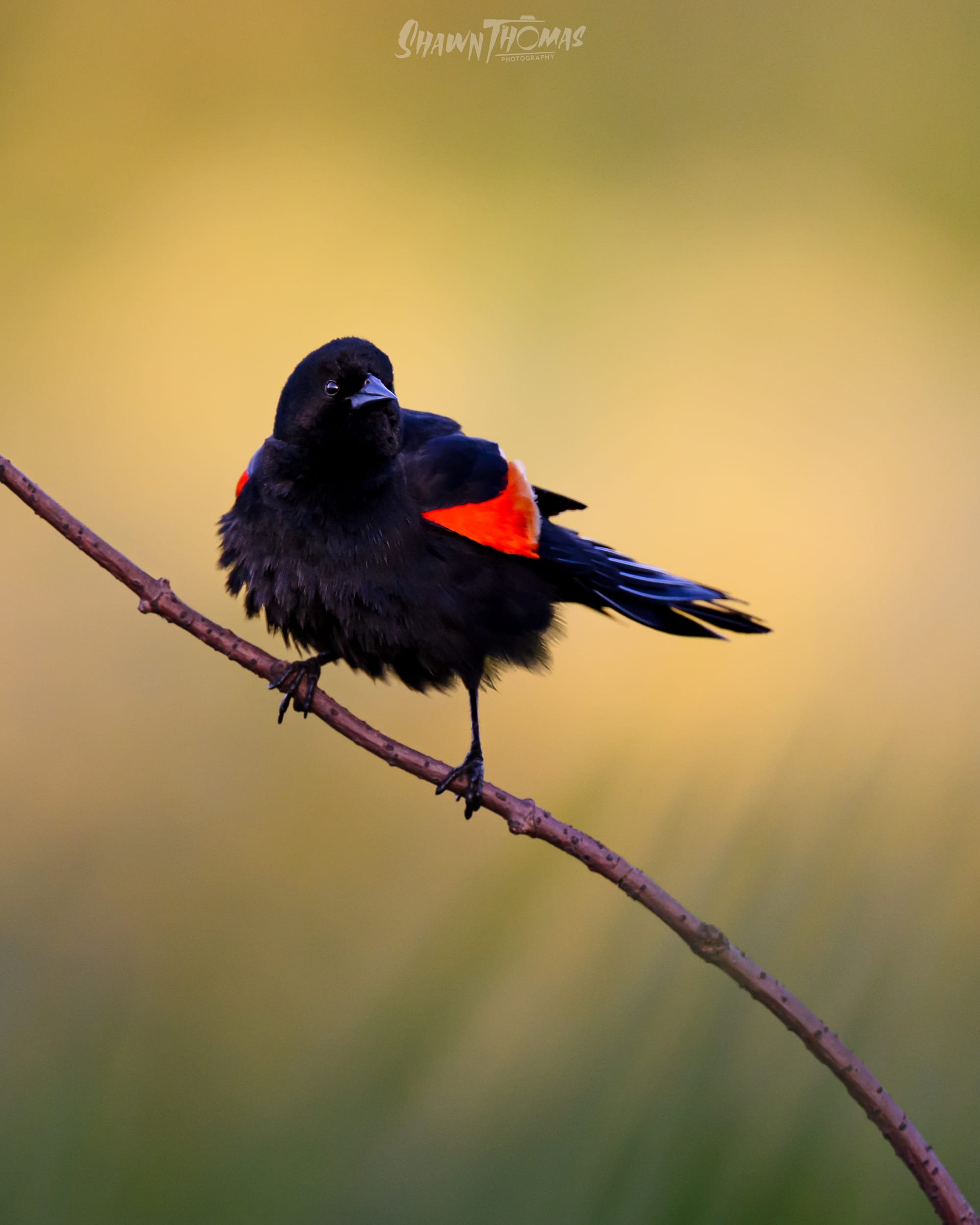
And here's the high-res final, in case you want to see what fourteen masks and zero saturation changes actually look like: